December is make-or-break for Mother Jones’ fundraising. We have a $350,000 goal that we simply cannot afford to miss. And in "No Cute Headlines or Manipulative BS," we explain, as matter-of-fact as we can, how being a nonprofit means everything to us. Bottom line: Donations big and small make up 74 percent of our budget this year and are urgently needed this month, and all online gifts will be matched and go twice as far until we hit our goal. Please pitch in if you can right now.
December is make-or-break for Mother Jones’ fundraising, and in "No Cute Headlines or Manipulative BS," we hope that giving it to you as matter-of-fact as we can will work to raise the $350,000 we need to raise this month. Donations make up 74 percent of our budget this year, and all online gifts will be matched and go twice as far until we hit our goal.
Do you happen to have a big, empty tank in the vicinity of Cushing, Oklahoma? If so, this is your lucky day! You can literally buy WTI crude oil for nothing as long as you’re willing to take physical possession of it. Maybe you can even get paid to take it off someone’s hands. Welcome to the new world of COVID-19 plus international squabbling over oil production. We no longer have oil shortages, we have oil storage shortages.
Over the weekend I posted an estimate from Kevin Systrom of how well states are doing in fighting COVID-19. I warned that I couldn’t judge its value independently, and sure enough, one of Tyler Cowen’s correspondents says it’s no good:
Estimating R from noisy real-world data when you don’t know the underlying model is fundamentally difficult….
There’s more at the link, and I have nothing special to say about this particular critique. However, I do have a couple of more general comments.
First, the Systrom estimate is based on case counts, and there’s no question that the reliability of case counts is very poor. Systrom compared case counts only within a 7-day period, and if you assume that the errors don’t change much over such a short period, then perhaps his resulting estimate isn’t too terrible. That said, no matter what statistical wizardry you apply to case counts, you’ll never escape the underlying crappiness of the data.
Second, don’t obsess over the fact that Systrom is estimating R. The underlying data is case counts, and you can do anything you want to them. If you want something that looks sort of R-like, you can do it by applying the appropriate transformations. If you want something that looks different, you can do that too. You’re better off thinking of Systrom’s results not as, literally, R, but as a derivation of “something related to the spread of coronavirus.” But remember that no matter what the derivation is, it’s just a different way of looking at case counts.
Third, I’m skeptical of the demand for an “underlying model” before you do anything else. You may have noticed that there are lots of models of the spread of COVID-19 and they’re all over the map. One of the reasons for this is simple: if you create a model de novo and then fit it to the data, you can get practically any result you want. Obviously experts have some insight into which models are better than others, but this is still a new virus with a lot of unknowns. And very small changes in model specifications can lead to surprisingly large changes in projections. Right now, an awful lot of the model inputs are assumptions with very little empirical backup because COVID-19 is so new, so you should take nearly any model projection with a big grain of salt.
This is where I am right now. Maybe I’m wrong and the models are better than I think. But watching the modelers apply massive amounts of math to fundamentally unreliable data has made me skeptical. This is why, for example, the only thing I show in my charts is daily deaths on a 6-day rolling average. You need to smooth the daily data in some way, but I don’t want to pretend like I’m showing you anything much more than just the basic numbers. And the mortality numbers, although far from perfect, are a whole lot better than case counts.
There’s so much stuff on the internet! How do you know what’s reliable and what’s not?
I’d be rich if I knew the answer to that, but there are tells. Software Cradle, for example, specializes in computational fluid dynamics and is a division of MSC Software, a global corporation that designs simulation software technology. That seems like a decent pedigree. It doesn’t mean that everything they produce is correct, but it probably means it isn’t junk either. So here is their simulation of a sneeze using their scFLOW software:
If this simulation is correct, the value of a mask isn’t that it reduces the amount of virus you shed, but that it redirects it. It mostly stays near you instead of being projected in the direction of other people.
As always, I’d love to see further research/modeling on this.
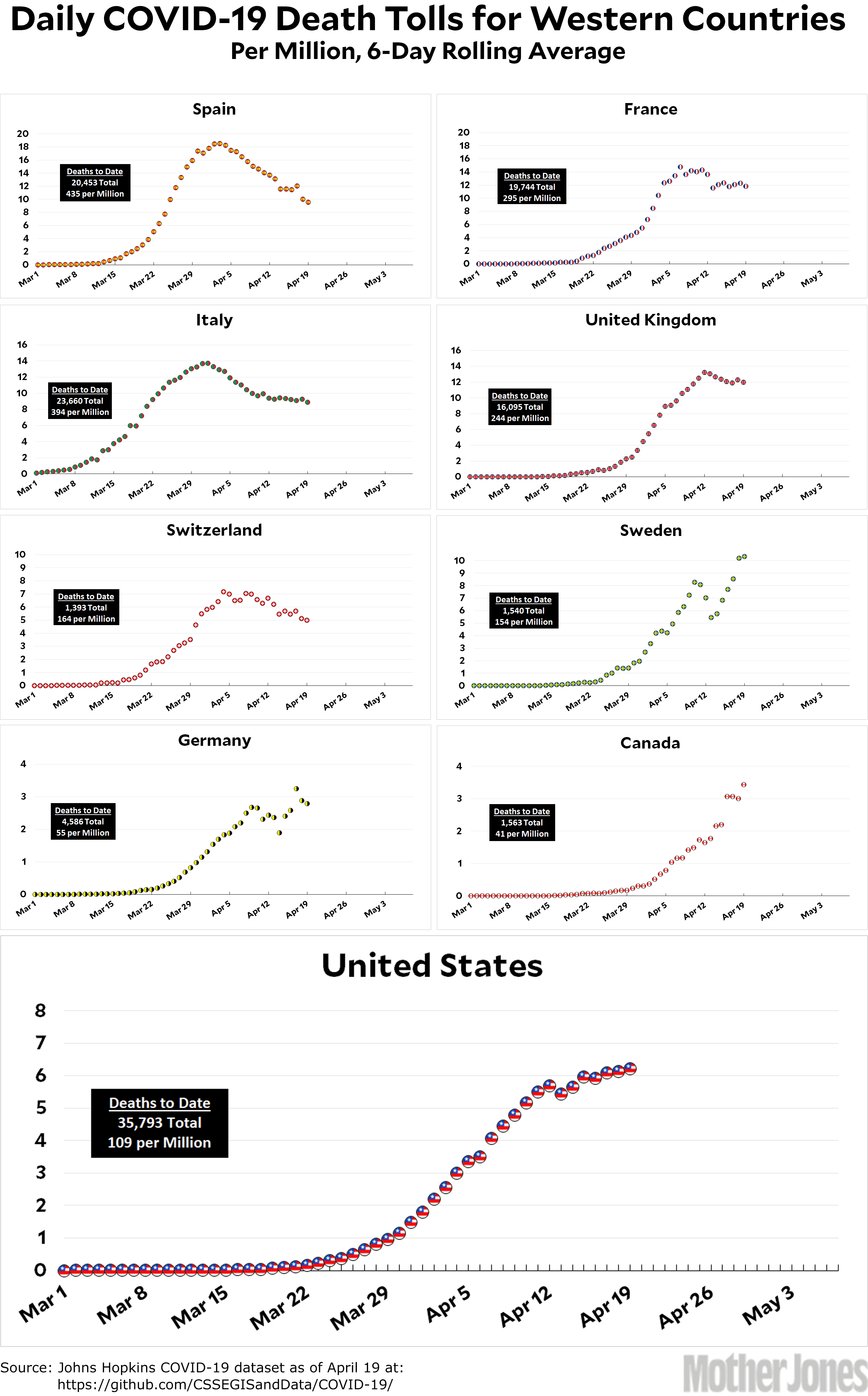
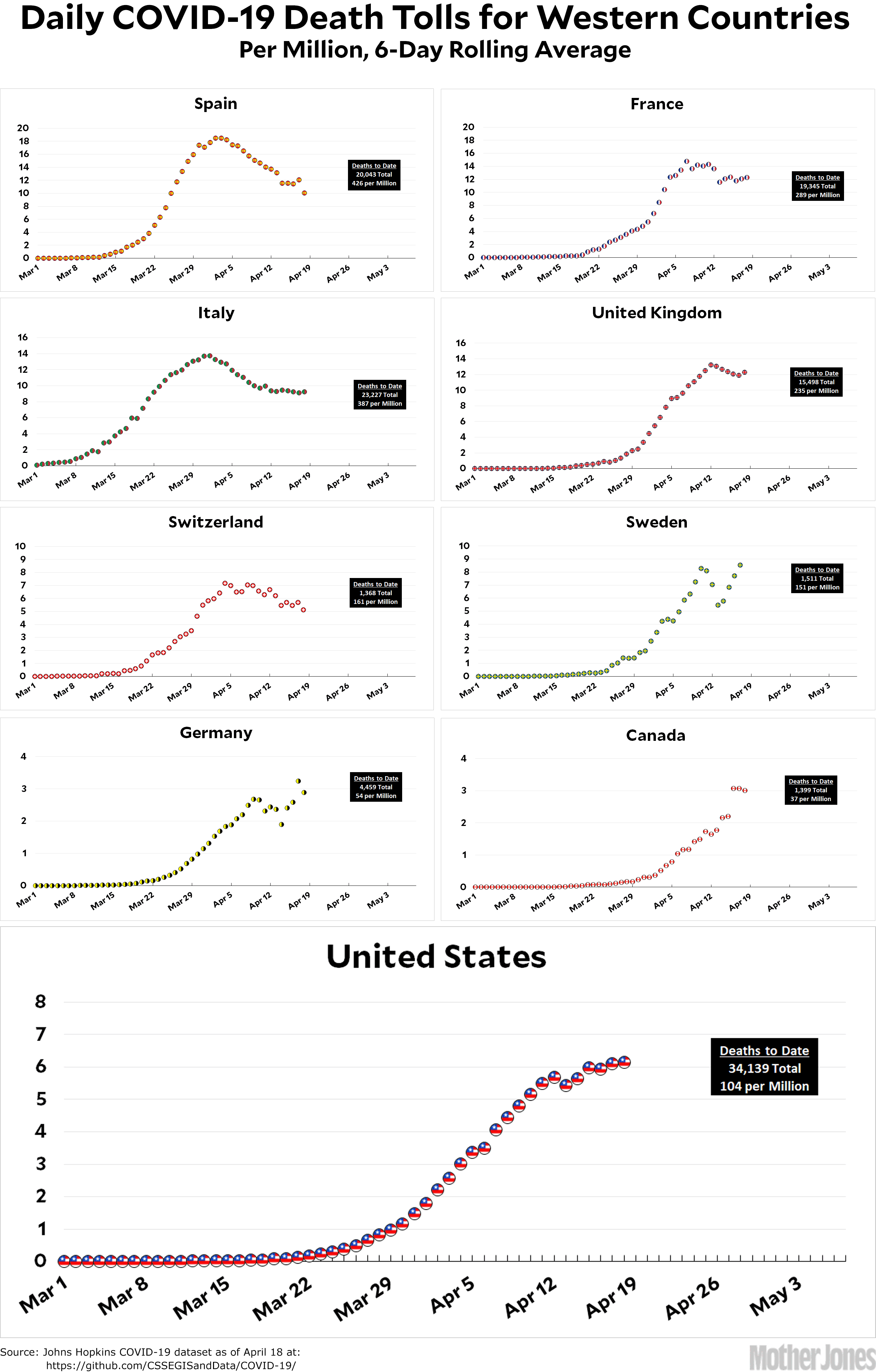
Here’s the coronavirus death toll through April 19. Spain continues to decline nicely. Italy and France are stalled, and Germany is too noisy to draw any conclusions. Sweden’s experiment with looser countermeasures doesn’t look like it’s paying off.
One note about Sweden, though. They’ve never claimed that their approach to COVID-19 will produce a low death toll. On the contrary, they’ve more or less admitted that it will produce a higher toll than tighter measures. However, they believe it will be only a little higher, and it will be accomplished with countermeasures that people can tolerate for months on end. The jury is still out on that.
The Trump administration and congressional leaders closed in Sunday on a $400 billion-plus deal to renew funding for a small business loan program that ran out of money under crushing demand, aiming to pass the agreement into law within days.
….The agreement also would include $75 billion for hospitals and $25 billion for testing, which have been major Democratic demands. Some of the money in the small business program would be directed specifically to rural and minority businesses, according to people familiar with the plan who spoke on the condition of anonymity to describe it.
What possible reason could there be for $25 billion in testing to be a “Democratic” demand? The single most unanimous agreement among experts is that we need to vastly increase testing and contact tracing before we start to loosen lockdowns and get back to (sort of) normal life. There’s literally not a single reason this should be a partisan issue.
But it is. For some reason Republicans resisted it for more than a week before caving in. What the hell is wrong with these people?
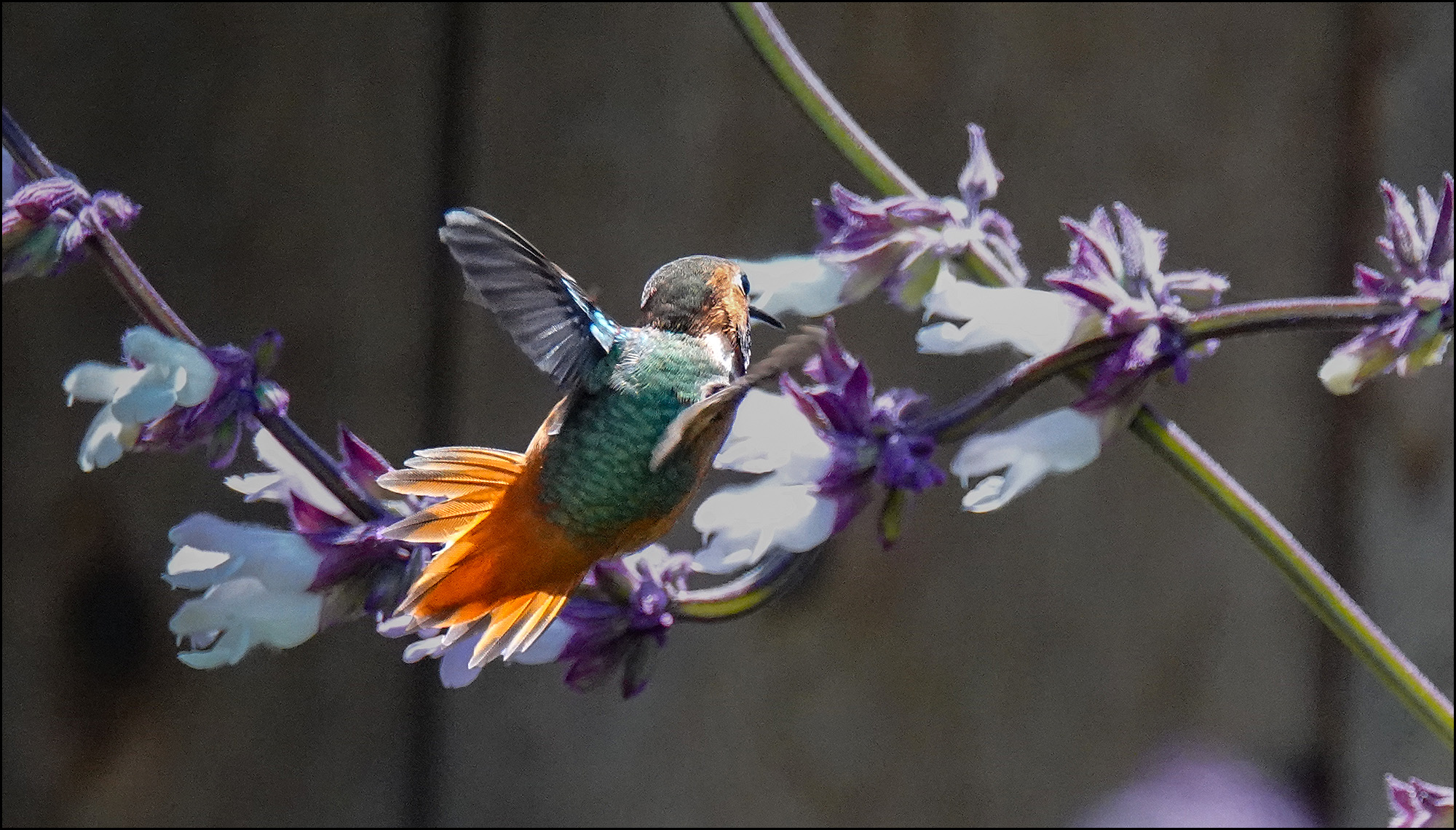
And now for the conclusion of flora and fauna in our front yard as photographed without moving from my chair. First up is our hummingbird. This is not technically a great shot, but I was fascinated by the spread-out, backlit tail feathers, which I haven’t seen before.
This is a true geranium. I’m sure it’s of some specific variety, but I don’t know which one.
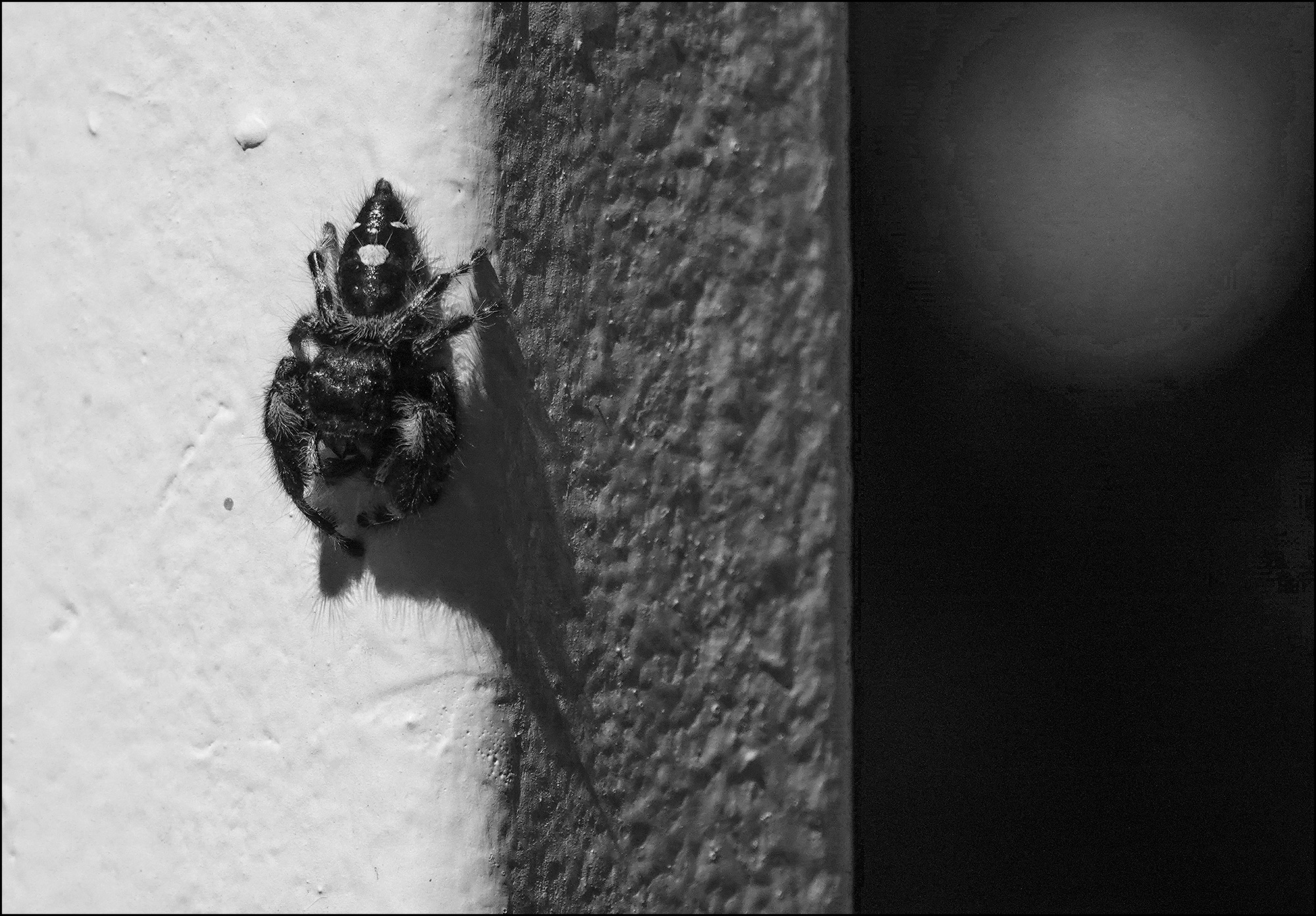
Here’s an itsy bitsy spider climing down our gate post. Possibly Phidippus workmani?
Another true geranium. This one is Geranium Biokovo, the 2015 Perennial Plant Association Plant of the Year.
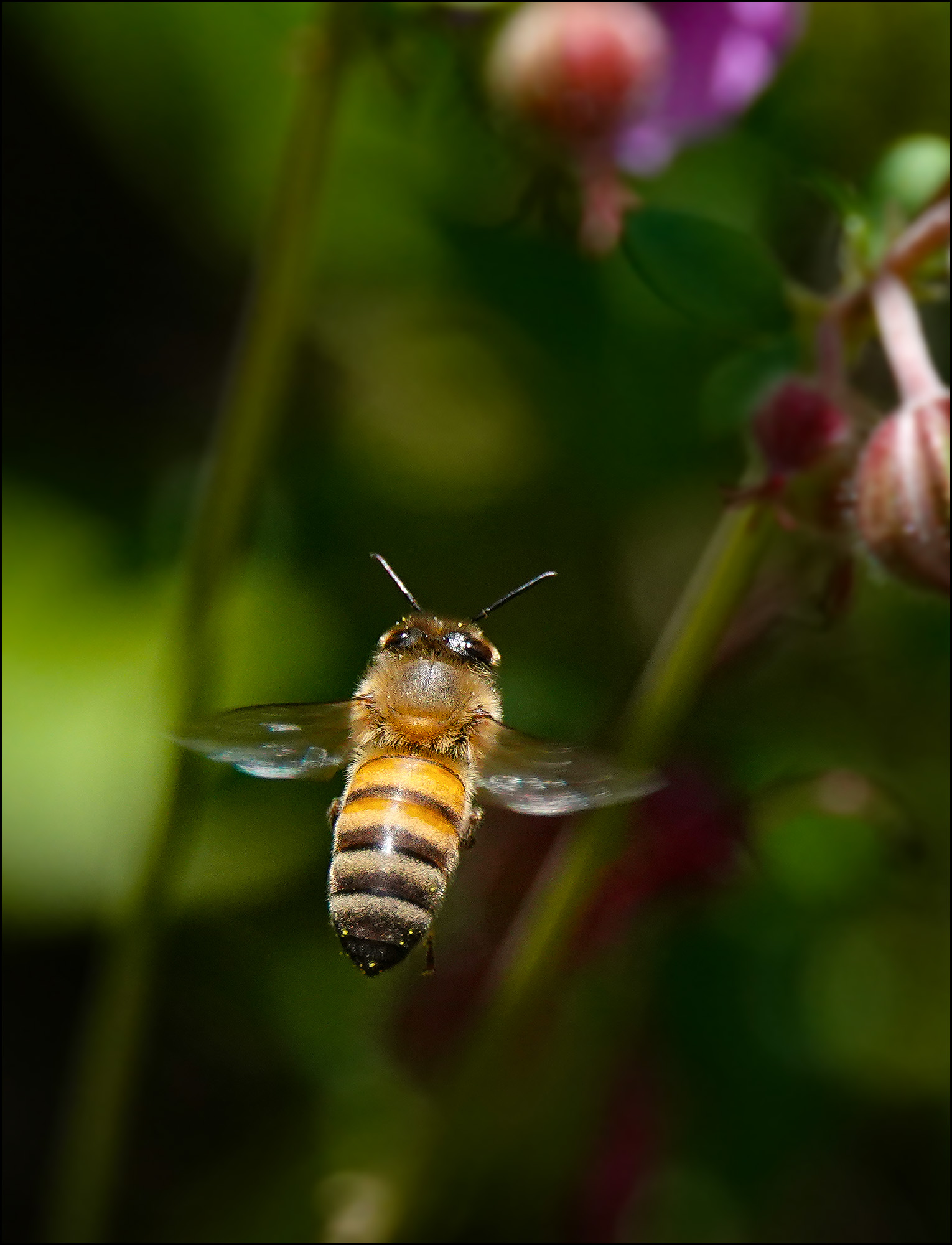
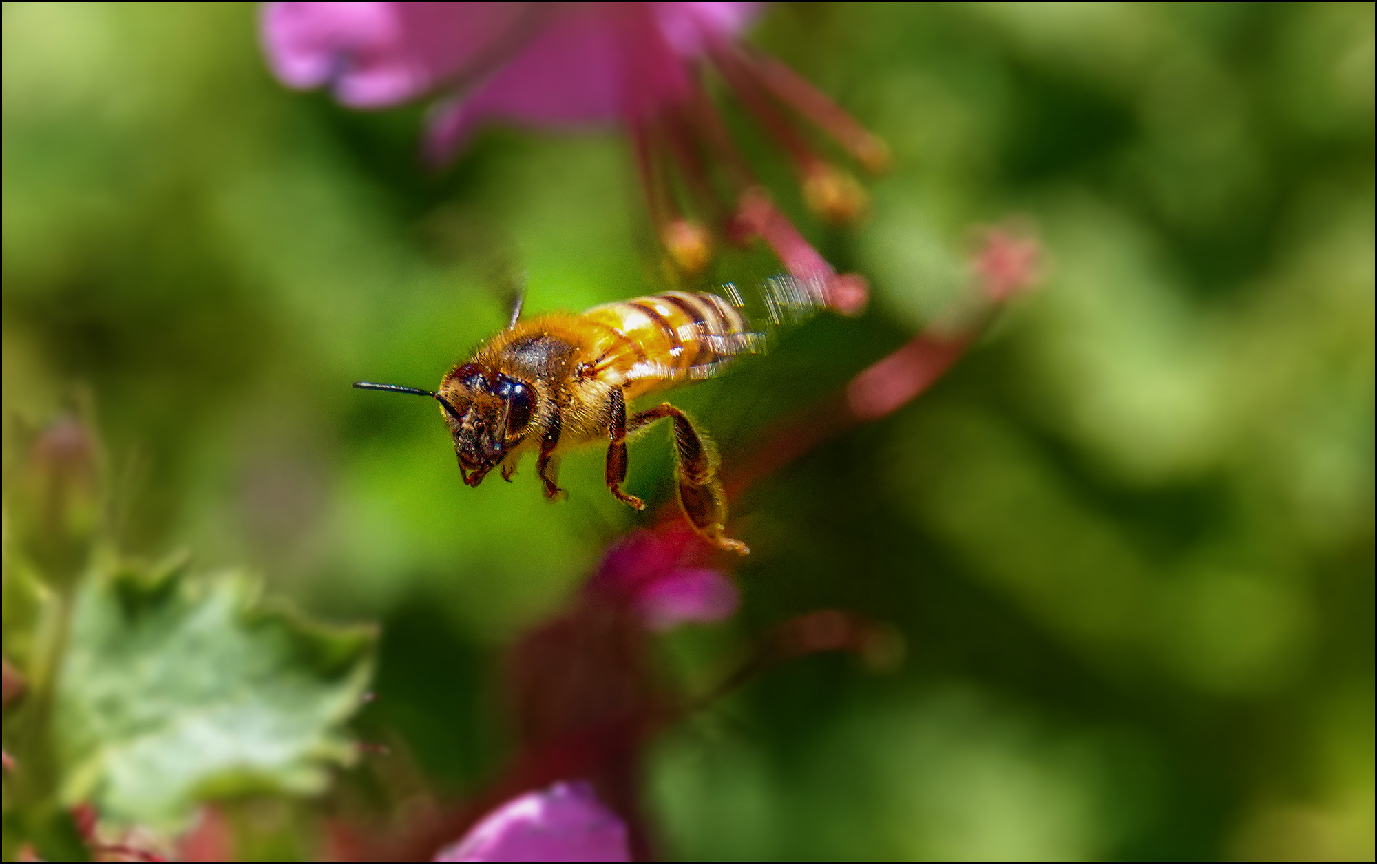
This is another one of our bees. I’m including it because it just happens to be a very nice, sharp picture of a bee in flight.
This is a salvia of some variety.
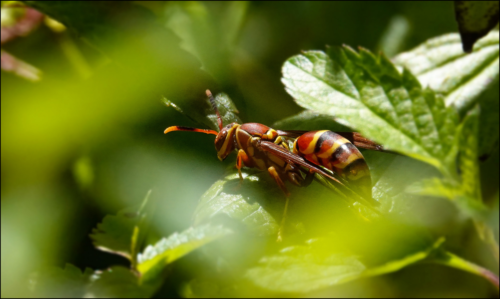
Here’s a clever little wasp who thought he could hide from me.
Another geranium! This one is a Geranium Karmina.
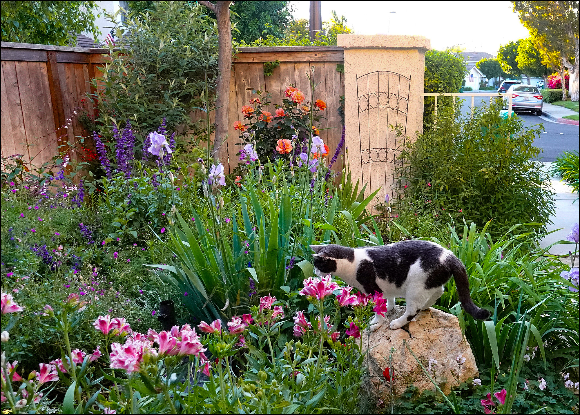
And finally, no survey of the local flora and fauna is complete without a picture of the apex predator, the queen of the jungle herself, Hopper. She loves the garden and frequently hides herself in the deep plants to take a nice little snooze.
Prabin Ranabhat/SOPA Images/LightRocket via Getty Images
How effective are masks at containing the spread of coronavirus? A new study suggests they don’t have much effect.
But I have questions. I know this will sound like I’m just defending my pro-mask position, but I promise I’m not. If further research confirms the “meh” position, then that will become my position too. But my first question was: how was the testing done?
Effectiveness of Surgical and Cotton Masks in Blocking SARS–CoV-2: A Controlled Comparison in 4 Patients
Patients were instructed to cough 5 times each onto a petri dish while wearing the following sequence of masks: no mask, surgical mask, cotton mask, and again with no mask.
I’m not too worried about the small sample size. It’s good enough for now. My second question is: how far away was the petri dish?
A petri dish (90 mm × 15 mm) containing 1 mL of viral transport media (sterile phosphate-buffered saline with bovine serum albumin, 0.1%; penicillin, 10 000 U/mL; streptomycin, 10 mg; and amphotericin B, 25 µg) was placed approximately 20 cm from the patients’ mouths….We do not know whether masks shorten the travel distance of droplets during coughing.
Hmmm. That’s eight inches. I don’t really understand that. If you’re going to bother doing this study at all, why not do a second test at two or three feet, which is far more applicable to the real world? After all, it’s possible that masks don’t reduce the volume of virus very much but do slow it down so it doesn’t get very far.
My skepticism also comes from personal experience. As someone with compromised breathing, I can report that when I wear a mask breathing gets a little harder. And if the mask reduces the volume of air reaching me, it surely must reduce virus transmission too. The coronavirus might be teensy, but N2 molecules are even teensier. But maybe I’m thinking about this wrong.
In any case, this seems like a study that should be fairly easy to replicate, and it really should be. In the meantime, I’ll urge everyone to use common sense. Even if you’re wearing a mask, you should cough or sneeze into your sleeve. This is a hard habit to get into for some, but as weird as it sounds you can develop the habit by practicing at home. Seriously. Just spend a couple of minutes a few times a day coughing into your sleeve. Eventually it becomes second nature.
Now all we have to do is get all 330 million of us to do this.
UPDATE: This paper has been retracted: “We had not fully recognized the concept of limit of detection (LOD) of the in-house reverse transcriptase polymerase chain reaction used in the study….Values below the LOD are unreliable and our findings are uninterpretable. Reader comments raised this issue after publication.”
Here’s the coronavirus death toll through April 18. I’ve decided the time has come to switch chart formats again. We’re now far enough into the pandemic that the raw mortality numbers are starting to give us some idea of whether this wave of the virus has peaked, and that’s what we’re all most interested in right now. So the new charts, which I introduced yesterday, simply track the daily death toll per million population. Easy peasy.
Sharp eyed readers will notice that the charts look slightly different than they did yesterday. That’s because I had an arithmetic error that I didn’t catch. I’ve gone over the data pretty carefully for today’s official debut, however, and I’m pretty sure the charts are all accurate now.
Do we really need to shut down restaurants? Or is this a countermeasure with low value at fighting COVID-19?Kevin Drum
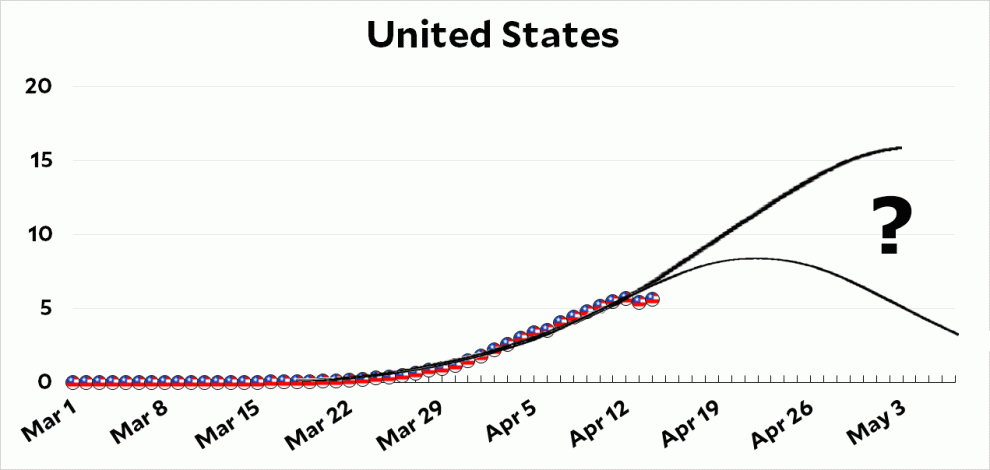
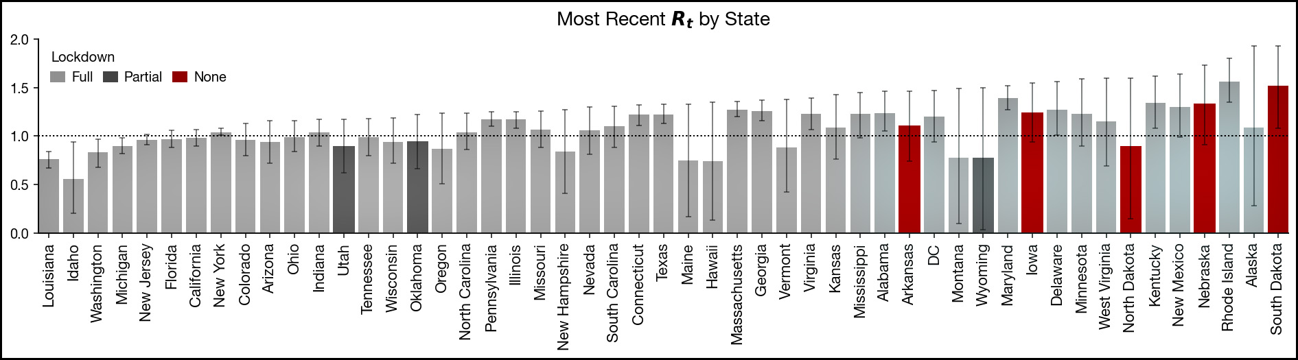
Reader SL forwarded to me an interesting estimate of how well each state is doing controlling the spread of COVID-19. I’m a little reluctant to write about this since I can’t independently judge it, but it’s a weekend, so let’s go wild.
The author is Kevin Systrom and he uses Bayesian statistics to estimate the trend value of R0 which tells us how fast the virus is spreading. Any value above 1.0 means that each infected person infects more than one other person. In that case, the total number of infections rises exponentially. A value below 1.0 means each infected person infects less than one person. In that case, the total number of infections will decline. Obviously our goal is to put in place countermeasures that will get the value of R0 below 1.0 and keep it there.
I’ve long been sort of fascinated by Bayesian statistics, even though it seems like it mostly produces the same results as ordinary frequentist statistics. But that’s OK: it means that the procedure outlined in “Real Time Bayesian Estimation of the Epidemic Potential of Emerging Infectious Diseases”—which Systrom applies to COVID-19—is probably fairly conventional. The real problem isn’t with the statistical methodology, but with the fact that Systrom relies on confirmed case counts, which we know to be highly unreliable. On the other hand, the algorithm compares case counts day-to-day over a period of seven days, and it’s likely that any errors in the count stay about the same over such a short period. So there’s reason to think that this approach might produce something useful.
(Note that these results only go through April 11. It would be interesting indeed to see an updated chart.)
The bars show the point estimate for each state: Idaho is lowest at R0 = 0.55 and Rhode Island is highest at R0 = 1.55. However, the states are arranged by the high point of their error bars. The reason for this is that the size of the error bars varies widely, and unless the top of the error bar is below zero you can’t be sure that R0 is truly below 1.0. Systrom suggests that if the top of the error bar is below 1.1, it means a state most likely has the epidemic “under control.” There are eight states in this category:
Louisiana
Idaho
Washington
Michigan
New Jersey
Florida
California
New York
The states that are worst off are the ones where even the bottom of the error bar is above 1.0. There’s not a remote chance that they’re anywhere near getting things under control. There are 12 states in this category:
Alabama
Virginia
Illinois
Kentucky
South Dakota
Pennsylvania
Connecticut
Texas
Georgia
Massachusetts
Maryland
Rhode Island
Systrom adds this: “It’s clear that all non-lockdown states cluster on the right-hand side. While we cannot be sure the true Rt value is that high, this graph should give any policymaker in a non-lockdown state pause.” (The non-lockdown states are the red bars in the chart above.)
Systrom takes this as evidence in favor of lockdowns, but I have a different interpretation. Take California, which is the poster child for taking COVID-19 seriously. We locked down early and tight and Systrom puts our R0 at about 1.0. Meanwhile, South Dakota is the poster child for its governor’s refusal to even think about lockdowns and Systrom puts their R0 at 1.5.
Think about that. There are differences between states, of course, and that might account for part of what’s going on. Still, an enormous disparity in countermeasures produced a difference in R0 of only 1.0 vs. 1.5. That doesn’t seem like an awful lot. FWIW, I take it as yet another piece of data that we’re locking down without knowing which measures really work and which are window dressing. There’s just too much evidence accumulating that the value of (some) countermeasures is simply not as great as we’ve been assuming.
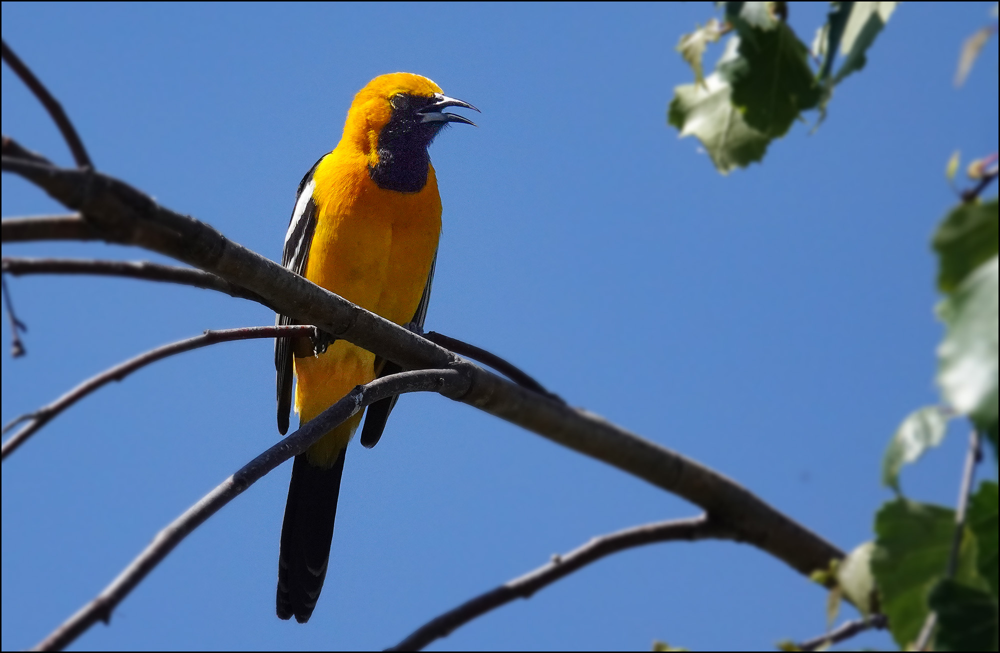
A few days ago Marian told me she had seen an oriole in our front yard. An oriole? Aren’t those from Baltimore or something? Sure enough, though, it turns out there are loads of different kinds of orioles, including many that populate the western US. I had just never seen one before. So I got a chair and went outside to wait for the oriole to show up.
Unfortunately, our oriole was a shy fellow. He would flick by momentarily, attracted by the yummy, luscious orange that Marian put out, but then he’d fly away before I could even focus the camera. After a couple of rounds of this, I decided to sit in my chair more often. And then I decided that as long as I was sitting in my chair, I would take pictures of all the flora and fauna of our front yard that I could capture without moving. Here it is. Part 1 is today; Part 2 is coming up tomorrow.
I did eventually get a picture of the oriole. He never got close, so it’s not a great picture, but it is a hooded oriole.
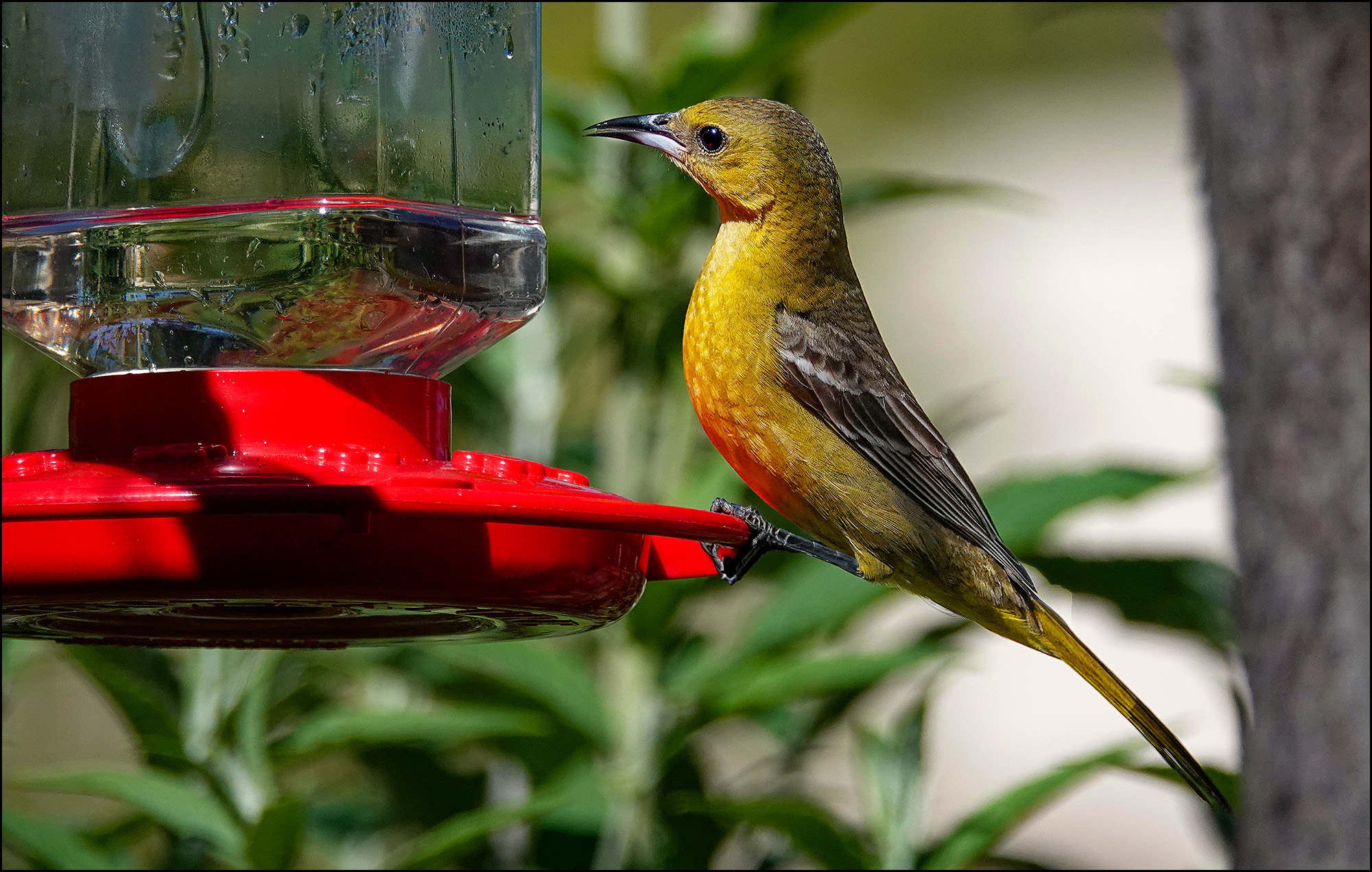
I’m not sure what this is. A female hooded oriole stealing the hummingbird food? UPDATE: Yes, it’s a female hooded oriole.
You’ve seen this flower before. It’s an Easy-Does-It rose, just blooming. Later in life it will develop a light, subtle pinkish and salmon color.
No flora and fauna gallery would be complete without hummingbirds. The key to a good hummingbird picture is luck. Basically, you put the camera in burst mode and set the autofocus to continuous. This is a little less accurate than the primary autofocus, but it tracks moving objects and tries to maintain focus on them. It works pretty well, but it only occasionally produces a picture that’s really tack sharp. I only got one.
What’s also interesting about this picture is that it was shot at 1/3200th of a second but the hummingbird’s wings are still frozen. I thought I needed at least 1/20,000th for that. This is good to know since the lower shutter speed allows a lot more flexibility in my other settings.
This is the same hummingbird, shot later in the day when the sun was shining directly on its throat. This was shot at 1/250th of a second, which produces an interesting (and lucky) effect: the bird’s throat is sharp but the rest of its body is fuzzy.
These are the stems of our bearded iris.
Here’s a honey bee with its mind clearly on a nice little snack.
Some pink and white alstroemeria plants.
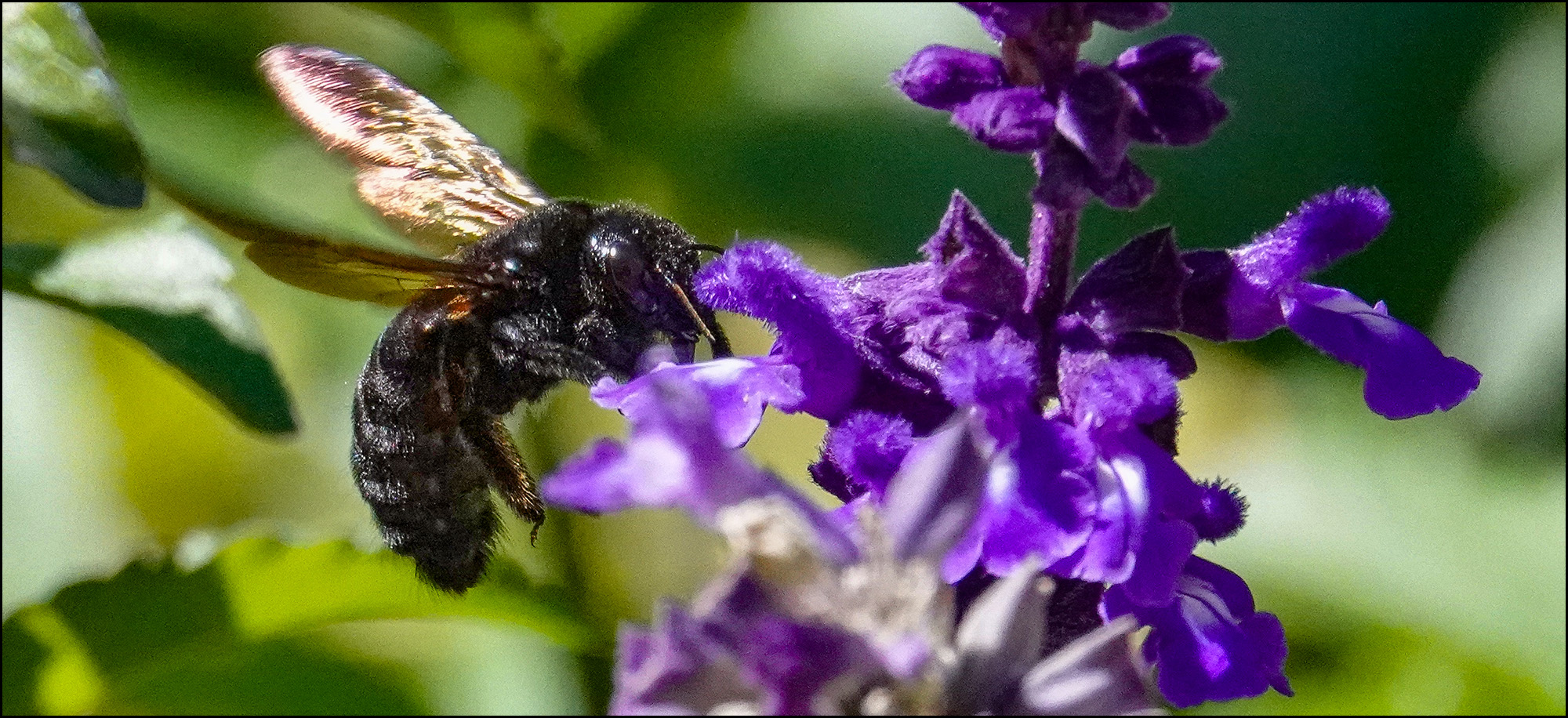
Ooh, this is a pure black bee of some kind, perhaps a rare example of A. darthvaderis.
I don’t know what this is. Maybe moss phlox? UPDATE: It’s Chamaesyce hypericifolia, otherwise known as graceful sandmat.
Can you pitch in a few bucks to help fund Mother Jones' investigative journalism? We're a nonprofit (so it's tax-deductible), and reader support makes up about two-thirds of our budget.
We noticed you have an ad blocker on. Can you pitch in a few bucks to help fund Mother Jones' investigative journalism?
Billionaires own the media, but they don’t own us.
At Mother Jones we know these aren’t conventional times, and they require unconventional coverage. That’s what we deliver every day: fierce, independent journalism you can’t find elsewhere. Perhaps never in the history of our country has that been more necessary than now. But we can’t do it without reader support—your support. Please chip in today.