• China and the Coronavirus: A Timeline

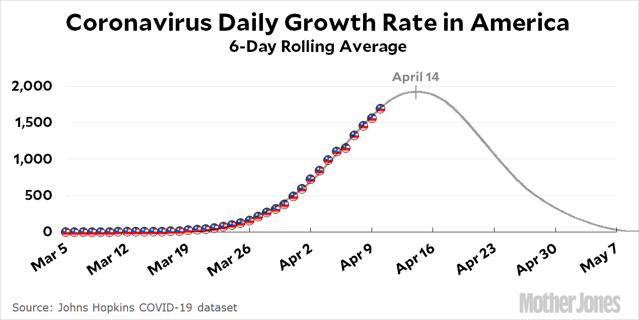
    Even the playgrounds are all shut down.Kevin Drum

    A few days ago I got curious about the notion that China has been a bad actor in the coronavirus saga. Like most of us, I was paying only vague attention back in December and January, so I had to go back and refresh my memory about who did what. Then I put together the timeline below.

    It’s not meant to be exhaustive, but it’s not meant to be cherry picked either. As near as I can tell, there are three distinct phases to the Chinese response:

    December: It’s genuinely unclear what the source of the “viral pneumonia” outbreak in Wuhan is.

    Early January: Chinese authorities obviously have some idea of what’s going on, but they lock down communication and arrest anyone who suggests the illness is SARS related.

    Mid-January: By January 7 Chinese scientists have sequenced the genome of the coronavirus. On January 12 they make the genome available to labs around the world. There is no longer any effort to deny what’s happening, although the quarantine response in Wuhan remains sluggish until late January.

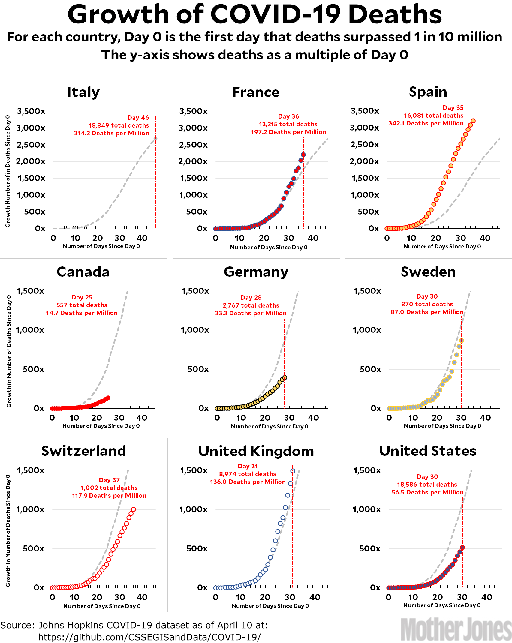
    In other words, my sense is that there’s maybe two weeks or so in early January when the Chinese authorities should have been more forthcoming. On the other hand, this was a period in which they were just coming to grips with what was happening, and they probably wanted to avoid panic until they were sure of their conclusions. In a sense, this only puts them in the same company as everyone else. With just a few exceptions, every country has responded too late, waiting until cases were in the hundreds before finally taking action.

    So yes: China should have been more forthcoming. They should have invited the CDC to help them. They shouldn’t have clamped down on social media. They should have confirmed human-to-human transmission a few days earlier than they did.

    At the same time, this panicked behavior lasted only a couple of weeks or so, and it’s unclear if it actually slowed down the response in the rest of the world. Compare that to President Trump, who downplayed the significance of the pandemic for nearly two full months, all of it well after Wuhan had started taking lockdown steps and everyone knew the potential danger of the virus. His recklessness makes China look like the Albert Schweitzer of pandemic response.

  • Coronavirus Growth in Western Countries: April 11 Update

    Here’s the coronavirus growth rate through April 11. Germany showed a big decline today in its daily death rate, but they also reported fewer cumulative deaths than yesterday. I suspect a reporting error. Italy hiccuped, but hopefully is still on a downward trend. Spain is declining. Canada, as always, remains teacher’s pet. And the United States has had a couple of days higher than trend. This might be nothing, or it might suggest that our peak will be a little farther away than Tuesday. There’s just no way to know until it happens.


    How to read the charts: Let’s use France as an example. For them, Day 0 was March 5, when they surpassed one death per 10 million by recording their sixth death. They are currently at Day 37; total deaths are at 2,309x their initial level; and they have recorded a total of 206.7 deaths per million so far. As the chart shows, this is above where Italy was on their Day 37.

    The raw data from Johns Hopkins is here.

  • I Have a Question About “Flattening the Curve”

    I’m puzzled by something. A few weeks ago, before we had adopted any social distancing measures, the COVID-19 models suggested that we’d hit a peak of 5,000+ deaths per day sometime in late April or early May. Then, in mid-March, we started adopting countermeasures. Famously, these countermeasures were supposed to “flatten the curve.”

    As you can see, countermeasures were supposed to lower the peak number of deaths but push the peak outward. The total number of deaths would stay roughly the same.

    But that isn’t what’s happened. The peak has been pulled forward and the total number of deaths has been cut by two-thirds or more. What’s going on here? What am I missing?

  • Are We Ready To Peak Next Tuesday?

    Just for the record, here’s my crude eyeball guess about the growth of COVID-19 in America:

    This suggests a total death toll through summer of about 60,000. I have a hard time believing this, but both my own projections and the expert modelers seem to have converged right around here. It would leave us with a final death toll of about 0.2 per thousand by the end of summer, which would be extraordinary. I admit that I can’t account for this considering the clear evidence that our response to COVID-19 was messy and chaotic. Maybe God really does watch over fools and children.

    POSTSCRIPT: Different states and cities will peak at different times, so there will still be some areas that are growing even when the country reaches its overall peak. By the end of the week, however, pretty much every state should have peaked and should start declining.

  • Three Charts Show How Important COVID-19 Countermeasures Are

    Why has California done better than New York in suppressing the spread of COVID-19? There are several reasons, but one of them is that California adopted lockdown measures sooner than New York. California beat New York by three days, and when you count in local lockdowns ordered by cities and counties it’s more like seven days. Here’s a stylized¹ look at what that can do:

    The blue line represents California, which adopted physical distancing measures at the beginning of the month and reduced the daily growth of coronavirus from 20 percent to 15 percent. The orange line represents New York, which did nothing for the first week but then adopted physical distancing measures for the rest of the month. There are two things to notice here:

    • The obvious one is that California ends the month with 30 percent fewer COVID-19 cases.
    • The other one is that up through Day 12 you don’t really see any difference at all. As it happens, that’s also a 30 percent difference, but the absolute numbers are so small it looks like statistical noise. It’s only when you get to about Day 20 that you really start to see the difference.

    Now here’s a more extreme example: California adopts strict physical distancing measures while State A blows it off entirely. Here’s what it look like:

    You can notice the same two things, except exaggerated:

    • By the end of the month, State A ends up with a whopping 70 percent more COVID-19 cases than California.
    • The difference is barely noticeable on Day 12. As above, the difference is actually substantial, but the absolute numbers are so small they’re barely noticeable.

    These are just rough guesstimates applied solely to physical distancing. If you add in business closures, school closures, stay-at-home orders, and so forth, the difference in the growth rate will likely be far greater than 5 percentage points. If you want to see something truly impressive, check out a comparison of two states where one of them cut their growth rate in half with even more stringent countermeasures:

    By the end of 30 days, the blue state has reduced its COVID-19 growth rate by 93 percent compared to the orange state that did nothing. This probably represents approximately what happened between California and New York. But note once again that you barely even notice any difference until around Day 10 or 12. That’s how long it takes for these annoying countermeasures to really have an effect.

    It’s just like compound interest: a small change in the rate makes a big difference, and the longer you hold your money the bigger the difference becomes. So obey your lockdown orders! A couple of years from now we’ll undoubtedly have dozens of research papers that tease apart all the various countermeasures and figure out which ones worked and which ones didn’t. And of course this will all be cleverly controlled for demographics; reporting accuracy; cigarette smoking; general health at the national level; and better ways of estimating deaths consistently across countries. This will be enormously helpful when we run into our next pandemic. For now, though, all we know in a very general way is that countermeasures seem to work and can have a huge impact if they’re put in place early and kept in place for long periods.

    In other words, forget the peak we’re supposedly coming up to next week. We don’t just want to suppress COVID-19, we want to crush it, and to do that we need to keep countermeasures in place at least through the end of May and possibly through the end of June. After all, a greater rate of decline on the downside of the curve is just as important as a lower rate of growth on the upward side of the curve. Our motto going forward needs to be: A bit of pain now will save us all a great deal of pain in fall.

    ¹Stylized means this isn’t a real example with real numbers. I plugged in the growth numbers myself just to illustrate a point.

  • Coronavirus Growth in Western Countries: April 10 Update

    Here’s the coronavirus growth rate through April 10. Germany might be near its peak, but that remains unclear. If you remove a single outlier, France looks like it might be peaking right about now. The United States recorded 2,108 deaths, the first time the daily death rate has passed 2,000. However, this is consistent with the expected increase in daily deaths until we hit our peak.


    How to read the charts: Let’s use France as an example. For them, Day 0 was March 5, when they surpassed one death per 10 million by recording their sixth death. They are currently at Day 36; total deaths are at 2,202x their initial level; and they have recorded a total of 197.2 deaths per million so far. As the chart shows, this is above where Italy was on their Day 36.

    The raw data from Johns Hopkins is here.

  • Lockdowns Seem to Have Reduced COVID-19 Cases Substantially

    New York Gov. Andrew Cuomo showed this slide at his press briefing today:

    At the end of March, the highest estimate for hospitalizations was 136,000+. Today the peak is estimated at about 30,000. That’s a difference of 5x. Did the modelers screw up?

    Not really. Remember the Imperial College projections for the United States? They estimated about 2 million deaths if nothing was done; 1 million deaths if some countermeasures were taken; and 200,000 deaths if stringent countermeasures were taken. That’s a range of 10x. If you figure that we’ve taken fairly stringent countermeasures but not the maximum possible, then a reduction of 5x is about what you’d expect. Alternatively, if you ignore the Columbia University projection as an outlier, the IHME estimate has only gone down by about 2x. That’s what you’d expect if we took countermeasures that were just a little more stringent than their model assumed.

    At the end of March it was still not clear how stringent and how effective the coronavirus countermeasures would be. In the event, it looks like they worked pretty well, cutting cases by at least 2x and possibly more. This is why the model estimates have gone down: because we followed expert advice and locked ourselves down. Just as we hoped.

  • COVID-19 Testing Is Finally Going Well in the US

    Compared to other countries, how are we doing with COVID-19 testing? Pretty well:

    Up through mid-March our testing rate was terrible, but by early April it had picked up and has been rising steadily ever since. As of today, it’s better than nearly every European country except Italy and Switzerland.

    It’s worth noting that testing data is notoriously variable, so this is more a ballpark estimate than a solid report. Also, data is not available for every country. France, for example, has data only through early March, and Germany has no data at all.¹ Still, this chart has some value. We’ll need to up our testing game before we can reopen the economy, but we’re starting from a pretty good baseline.

    ¹At least, no data that’s reliable enough for the Our World in Data folks to report. Other estimates have put the German testing rate at around 0.6 per thousand, slightly higher than the US number.

  • Friday Cat Blogging – 10 April 2020

    My mother’s kittens are now 11 weeks old and they have discovered the upstairs room that was originally built as my father’s study. This is now where they frolic most of the time. From top to bottom we have: Meowser, the dutiful mama; Stripey, peering at the camera; Gray, peering around mama; Blackie, peering out of a bookshelf; and all three of them exploring the bookshelves together.