December is make-or-break for Mother Jones’ fundraising. We have a $350,000 goal that we simply cannot afford to miss. And in "No Cute Headlines or Manipulative BS," we explain, as matter-of-fact as we can, how being a nonprofit means everything to us. Bottom line: Donations big and small make up 74 percent of our budget this year and are urgently needed this month, and all online gifts will be matched and go twice as far until we hit our goal. Please pitch in if you can right now.
December is make-or-break for Mother Jones’ fundraising, and in "No Cute Headlines or Manipulative BS," we hope that giving it to you as matter-of-fact as we can will work to raise the $350,000 we need to raise this month. Donations make up 74 percent of our budget this year, and all online gifts will be matched and go twice as far until we hit our goal.
Any model of optimal policy should be “what should we do now, knowing the lockdown can’t last very long?” rather than “what is the optimal length of lockdown?”
The South Korean model has been endlessly praised, and it seems to have worked pretty well. It basically consists of two things:
Masks everywhere
Lots of testing and contact tracing
Only the second item is hard, but we could do it if Trump ever got serious about it. It’s a mystery why it seemingly remains on the back burner. It would be an ideal project for the federal government; it would allow Trump to invoke the DPA and other emergency powers; it’s highly public; and it’s something that every epidemiologist says is necessary, which allows Trump to say that he’s following the science. So why so little activity? Why not set a goal of a million tests a day and make a huge public spectacle out of tracking how close we are to our goal? Surely that would be a better campaign tool than daily meltdowns in the press room?
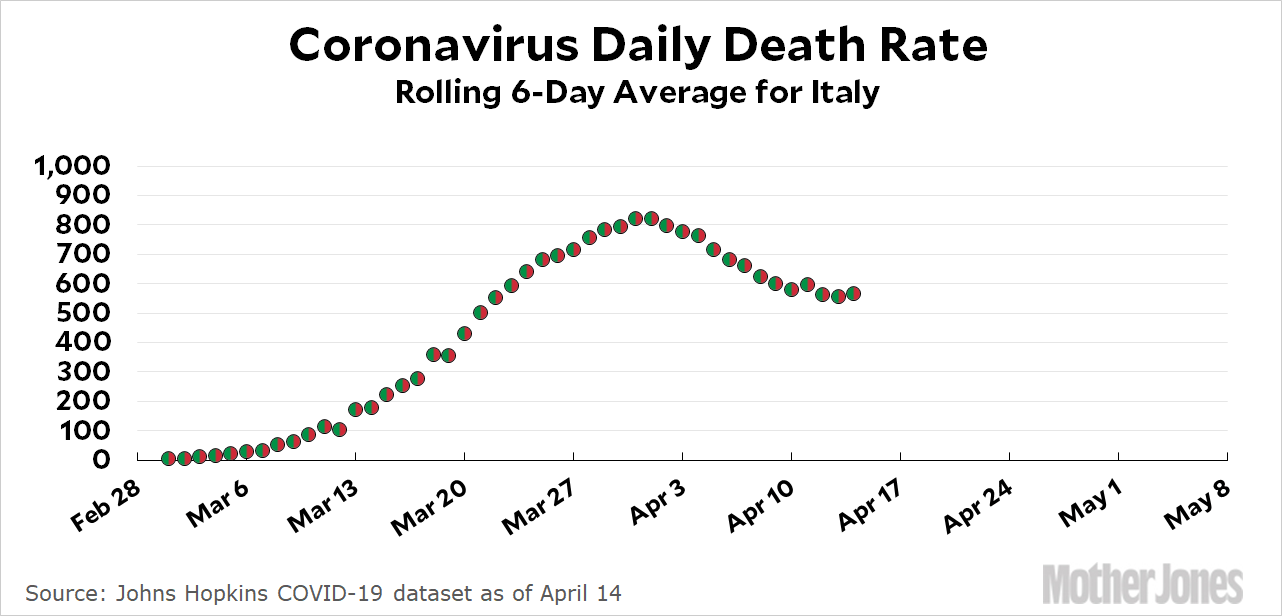
Here’s the coronavirus growth rate through April 14. This was a bit of a noisy day, but there was nothing that changed the trendlines very much except in Italy, where their decline seems to have stalled out temporarily:
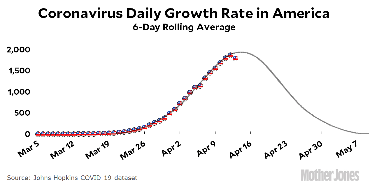
The United States recorded 2,228 deaths, a new high. However, our trendline looks the same as yesterday, with a peak still likely in the middle of this week. Unless it doesn’t happen, of course.
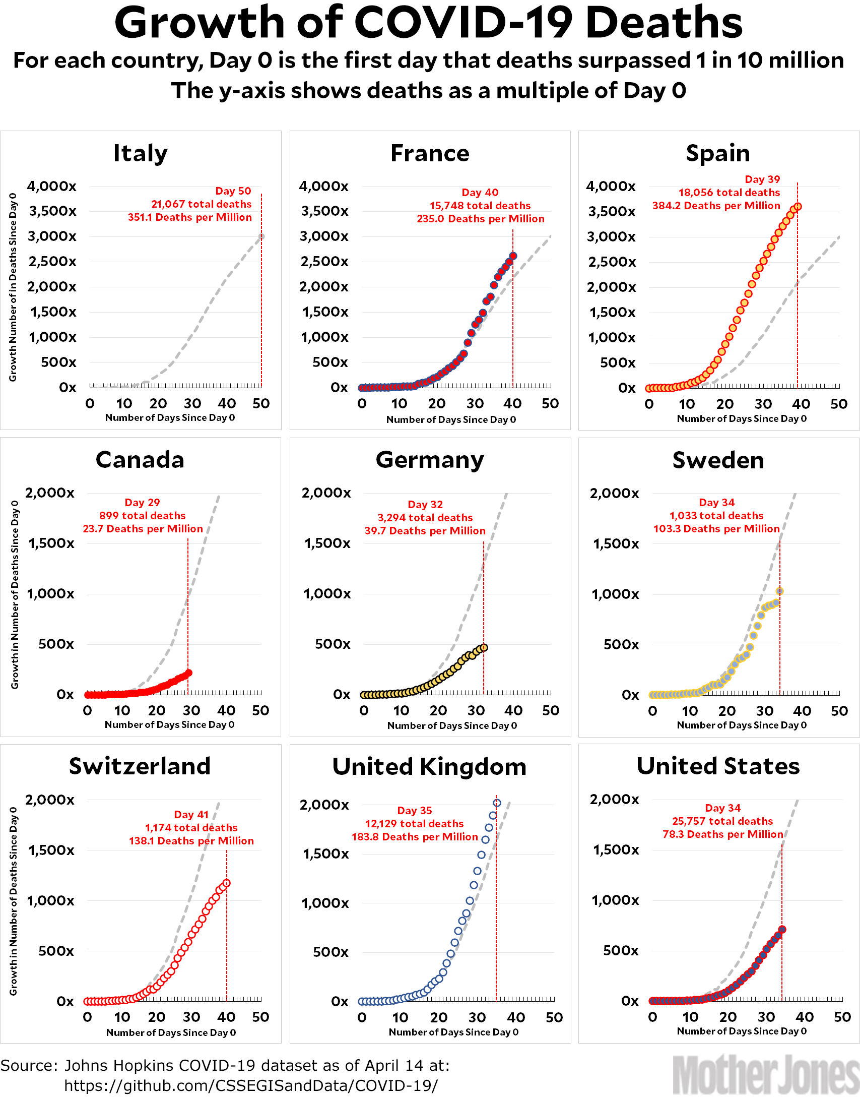
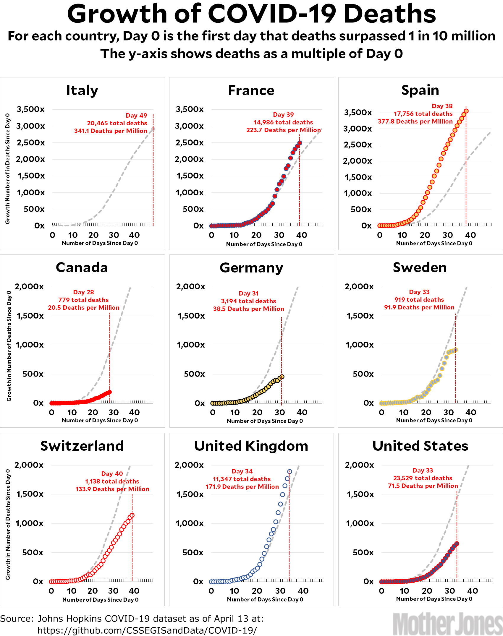
How to read the charts: Let’s use France as an example. For them, Day 0 was March 5, when they surpassed one death per 10 million by recording their sixth death. They are currently at Day 40; total deaths are at 2,625x their initial level; and they have recorded a total of 235.0 deaths per million so far. As the chart shows, this is above where Italy was on their Day 40.
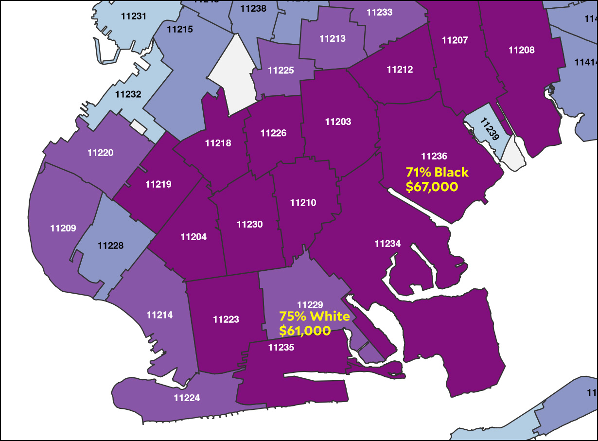
I’m sure you haven’t missed the news that African Americans are being diagnosed with COVID-19 at much higher rates than whites. There are multiple competing explanations for this: blacks have a higher incidence of hypertension; blacks have more pre-existing conditions in general due to structural racism; and blacks tend to be poorer than whites.
I wanted to check out the last of these, but that’s difficult since people diagnosed with COVID-19 aren’t asked about their incomes. So I puttered around trying to think of some kind of crude test that might at least point in a direction: if you control for income, are blacks still diagnosed at higher rates than whites?
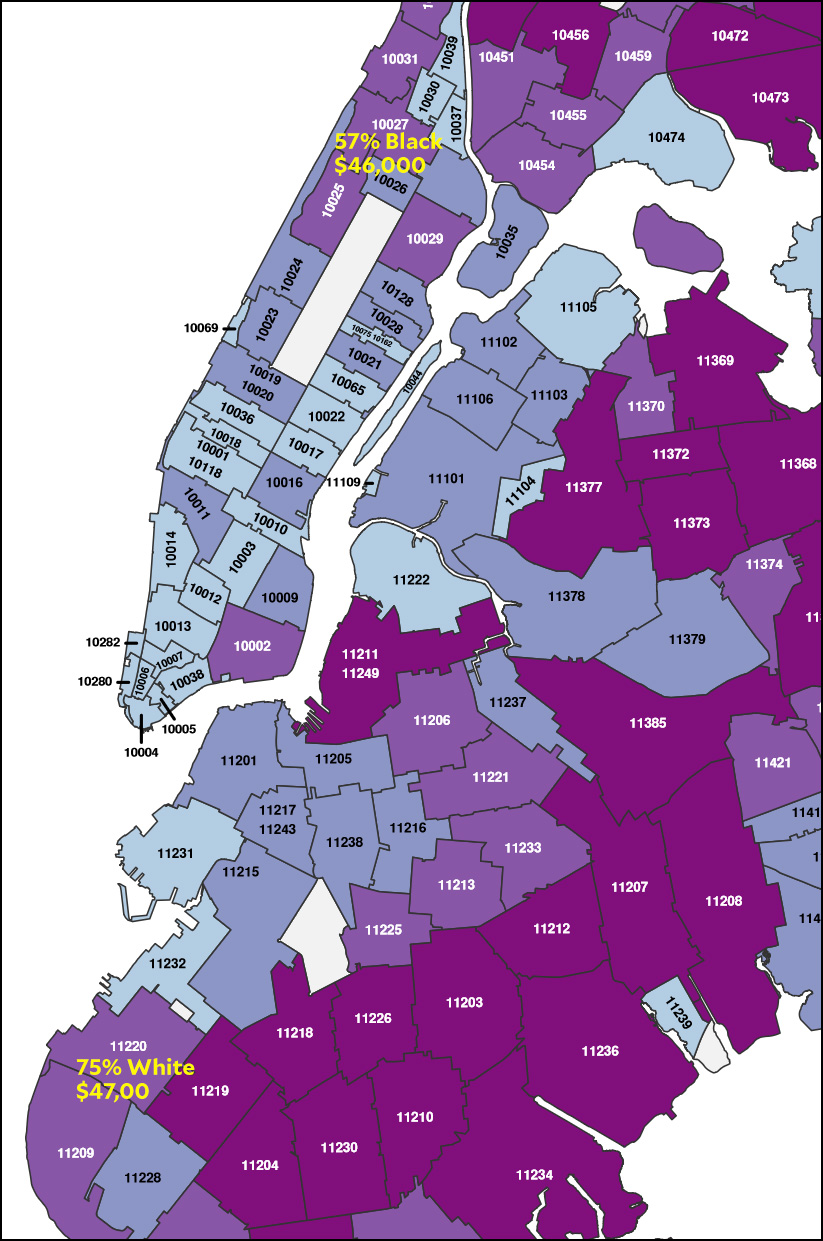
Eventually I hit on zip codes in New York City. What I did was look for mirror-image zip codes: zip codes with similar incomes but opposite numbers of blacks and whites. Would the majority black zip codes have a higher number of COVID-19 cases than majority white zip codes with the same average income? I came up with five pairs. Here’s the first:
The color represents the number of COVID-19 cases. Both of these zip codes have the same color, which means they are in the same range of cases even though one is 57 percent black and the other is 75 percent white. Here’s the second:
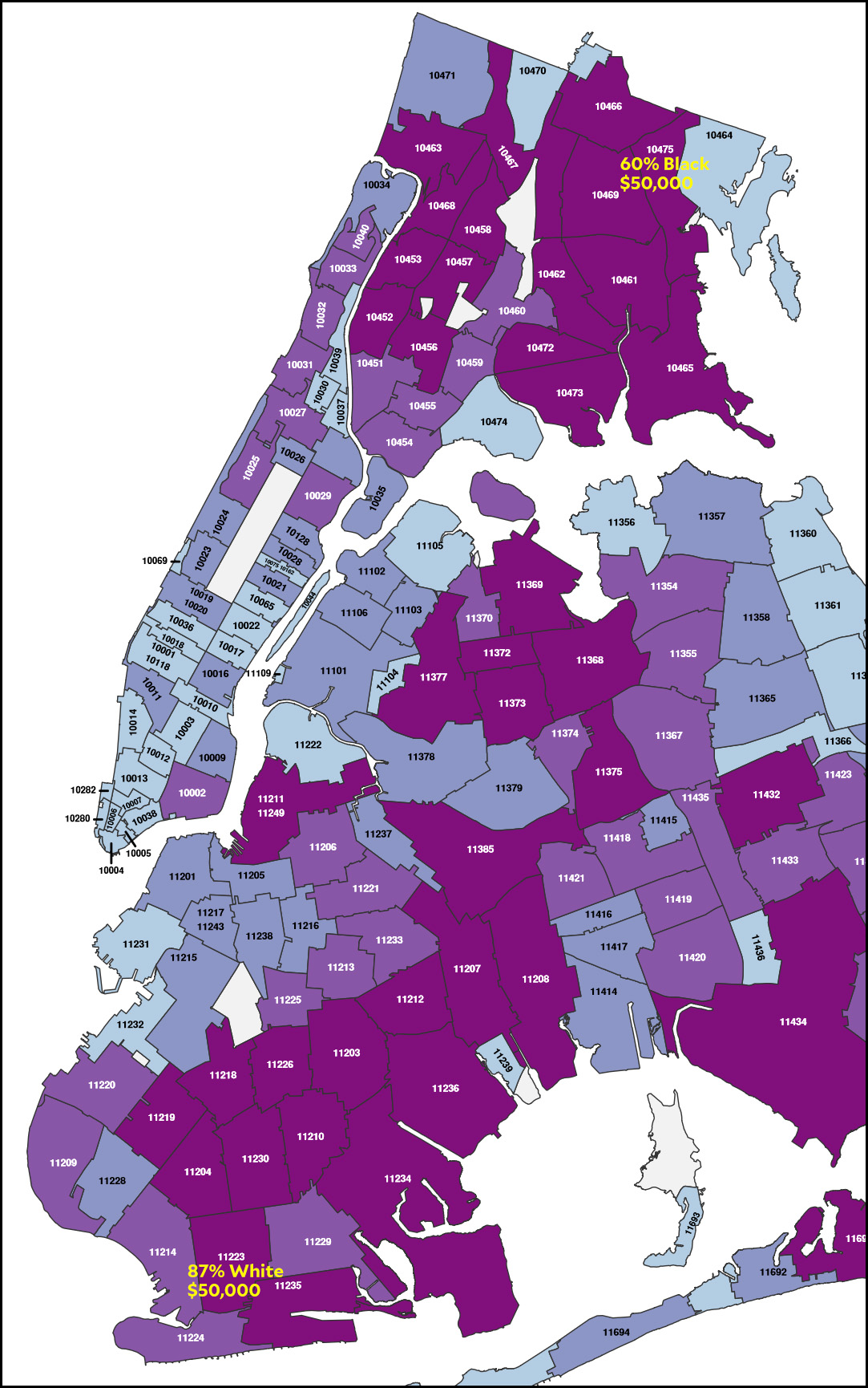
Same color again. Here’s the third:
Same color again. Here’s the fourth:
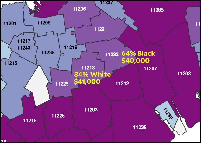
Same again. And here’s the fifth:
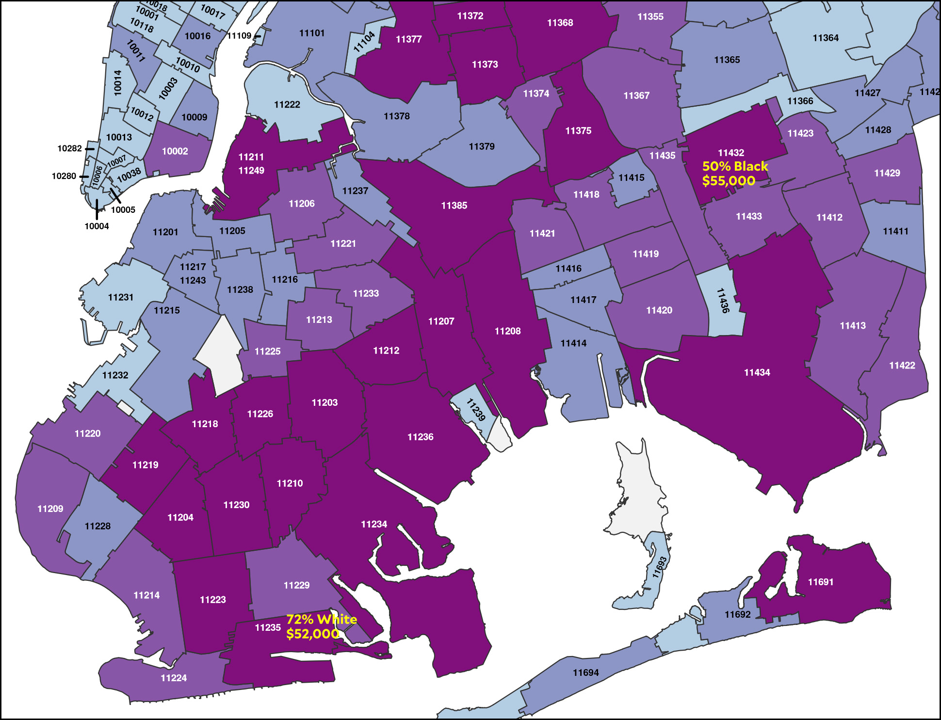
This time the black zip code has more COVID-19 cases than the white zip code.
Keep in mind that this proves nothing. It’s based on zip codes, not individual incomes. It’s based on a range of COVID-19 cases, not exact numbers. It’s only a sample size of five. Etc. However, it does seem to at least suggest that income may be the dominating factor in COVID-19 cases, not race. I don’t know if the data is even available to do a serious study of this, but it would be nice if someone could figure out a way to do it. Any takers?
I made this chart from this data https://t.co/OojDFkptL4 and unless I screwed it up it should freak you the fuck out. It’s for the first two weeks of April We’re not testing more every day. We’re testing less. Why isn’t this top of mind? pic.twitter.com/aYIRBrXmO7
— Dan Froomkin/PressWatchers.org (@froomkin) April 14, 2020
The answer, it turns out, has little to do with the CDC test anymore. Labs in the US are now pretty diverse: some use the CDC protocol, some use the WHO protocol, and others use tests developed by private companies. There are plenty of choices.
But even if there are enough test kits to go around, there’s still a limit to our processing capacity. And that’s made worse by bureaucratic hurdles that prevent academic labs from joining in. A recent article in Nature explains:
A Nature investigation of several university labs certified to test for the virus finds that they have been held up by regulatory, logistic and administrative obstacles, and stymied by the fragmented US health-care system. Even as testing backlogs mounted for hospitals in California, for example, clinics were turning away offers of testing from certified academic labs because they didn’t use compatible health-record software, or didn’t have existing contracts with the hospital.
….“There is a misconception that you only need a PCR machine and a PhD — that is 10% of what you need,” says Fyodor Urnov, a scientific director at the Innovative Genomics Institute at the University of California, Berkeley, which launched a testing operation on 30 March, after weeks of challenges. “My life is waking up at 3 in the morning, and thinking of the 24 things that will go wrong today.”
….A new wave of challenges began when the labs reached out to hospitals in need of tests. “The business of American medicine and the way it is organized is astonishingly unprepared for this,” Urnov says. One problem is that US hospitals use a range of software platforms for electronic health records. Many also have strict administrative procedures for setting up accounts with labs, exchanging samples and handling billing, adds Pride. For this reason, several hospitals chose to stick with the commercial labs they’re already working with, say researchers.
In California, the figures are stark: in late March, the state’s health department reported a backlog of almost 57,000 tests. Even so, Urnov says, hospitals rejected an offer of free tests from his centre, funded by philanthropic organizations. “I show up in a magic ship,” Urnov says, “with 20,000 free kits and CLIA and everything, and the major hospitals say: ‘Go away, we cannot interface with you.’”
This sounds like an area that’s genuinely ripe for presidential—or vice presidential—leadership. An emergency declaration would likely go a long way toward encouraging everyone to work together even if it means exchanging Excel spreadsheets via email for a few weeks. Unfortunately, that would require Donald Trump to implicitly admit that testing is not going quite as swimmingly as he’s been saying for the past month. That’s inconceivable, so instead testing will languish until we slowly build up our stock of test devices and slowly increase our daily throughput.
Our hummingbird was looking especially brilliant yesterday, so I went outside for a bit to see if I could get a picture. As usual, I didn’t. He just won’t do a fly-by when I’m sitting close at hand. However, while I was killing time I took some pictures of the surrounding flora, including this lovely Collette rose, a climbing rose that’s currently climbing on one of our trellises. It sports a very lovely, delicate orange/salmon color.
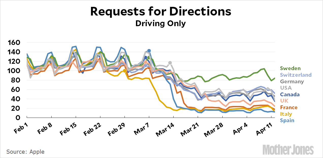
And here’s a related one. It’s from Apple and shows how many people used their iPhones to request driving directions:
This chart is pretty noisy, but it still gives you an interesting look at when people started taking COVID-19 seriously, regardless of when national governments imposed formal lockdowns. If you take requests for directions as a rough proxy for overall driving, Italy started driving less on February 29. The rest of Europe and Canada followed on March 5-7. The United States was a laggard, not starting to decline until March 13.
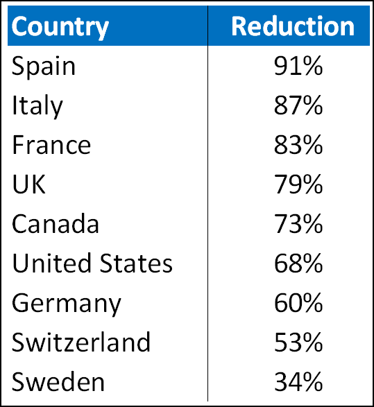
You can also get a feel for which countries took their lockdowns the most seriously. Sweden, with its famously casual approach, has reduced its driving by a modest 34 percent. Spain reduced its driving by a whopping 91 percent. Here’s a complete list:
If you want to play with this data some more, just click the link. The Apple spreadsheet also includes driving requests for individual cities if you want to compare, say, New York and Los Angeles directly.
As the pandemic has swept the globe, it has been accompanied by a dangerous surge of false information — an “infodemic,” according to the World Health Organization. Analysts say that President Vladimir V. Putin of Russia has played a principal role in the spread of false information as part of his wider effort to discredit the West and destroy his enemies from within.
….His agents have repeatedly planted and spread the idea that viral epidemics — including flu outbreaks, Ebola and now the coronavirus — were sown by American scientists. The disinformers have also sought to undermine faith in the safety of vaccines, a triumph of public health that Mr. Putin himself promotes at home.
….The Russian president has waged his long campaign by means of open media, secretive trolls and shadowy blogs that regularly cast American health officials as patronizing frauds. Of late, new stealth and sophistication have made his handiwork harder to see, track and fight.
….Sandra C. Quinn, a professor of public health at the University of Maryland who has followed Mr. Putin’s vaccine scares for more than a half-decade, said the Russian president was drawing on an old playbook. “The difference now is the speed with which it spreads, and the denigration of the institutions that we rely on to understand the truth,” she said in an interview. “I think we’re in dangerous territory.”
I imagine this kind of thing was common on both sides during the Cold War, and that’s the era that defined Putin’s worldview. But it’s still a little beyond belief that even a wily thug like Putin would keep up this kind of rubbish more than three decades after the wall came down. This stuff doesn’t just damage America, it damages the entire world. Hell, it probably even damages Russia in the long run. What stupidity.
Sorry, but Republicans don't care about you unless you're the millionaire owner of a "pass-through entity."Liu Jie/Xinhua via ZUMA
When the coronavirus rescue bill was passed, it brought everyone’s priorities into high relief. Republican provisions solely benefited corporations. Democratic provisions benefited laid-off workers, hospitals, schools, local governments, and struggling families on food stamps. It’s rare to see such a stark difference in values set down for posterity in a single place.
But there’s more! Republicans have been moaning for the past couple of years that their 2017 tax cut had some provisions that were insufficiently friendly to businesses run by rich people. In the coronavirus bill they fixed that:
More than 80 percent of the benefits of a tax change tucked into the coronavirus relief package Congress passed last month will go to those who earn more than $1 million annually, according to a report by a nonpartisan congressional body expected to be released Tuesday. The provision … will cost taxpayers about $90 billion in 2020 alone, part of a set of tax changes that will add close to $170 billion to the national deficit over the next 10 years, according to the Joint Committee on Taxation (JCT), the nonpartisan congressional body.
….An analysis by the JCT found suspending the limit overwhelmingly benefits higher earners. About 82 percent of the benefits of the policy go to about 43,000 taxpayers who earn more than $1 million annually. Less than 3 percent of the benefits go to Americans earning less than $100,000 a year, the analysis found….Hedge-fund investors and owners of real estate businesses are “far and away” the two prime beneficiaries of the change, said Steve Rosenthal, a tax expert at the Tax Policy Center, a nonpartisan think tank.
Ain’t that grand? When it comes to rich people, Republicans will work and work and work for every little tax advantage they can dream up. But even in the middle of a pandemic, they can’t bring themselves to care about the working and middle classes. I wonder what other goodies are packed into that bill?
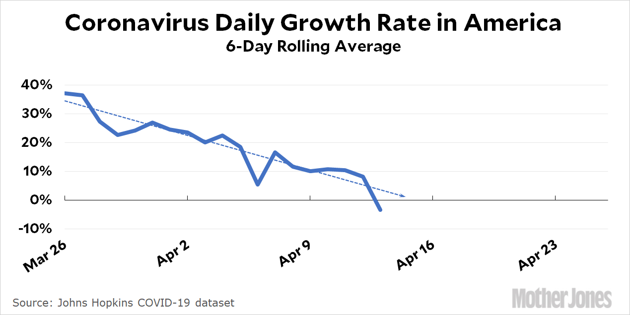
Here’s the coronavirus growth rate through April 13. It really looks like nearly every country has either peaked or is very close to peaking.
So let’s take another close look at the United States. As always, IANAE and there’s nothing sophisticated about my projections. However, they’re also completely transparent. It’s easy to see what I’m doing and decide if you feel like taking it seriously. First off, here’s the growth rate of the daily death toll (smoothed using a 6-day rolling average):
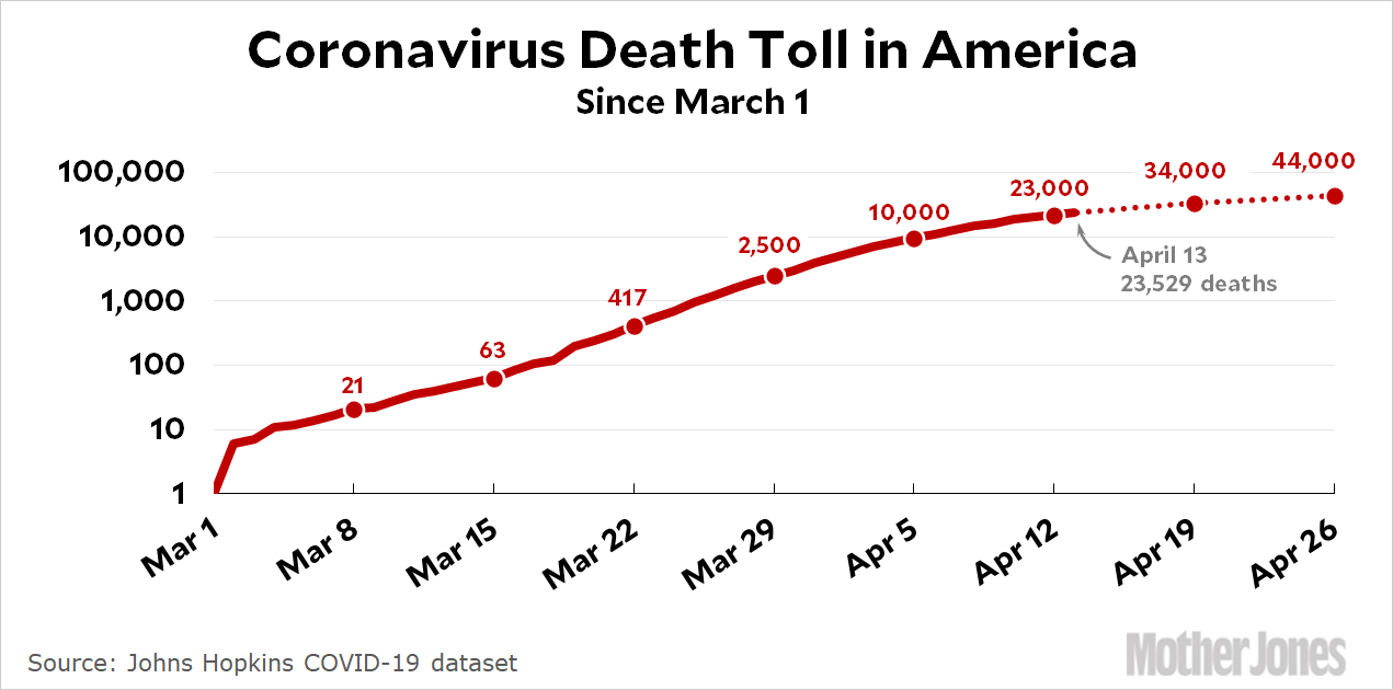
The daily death toll has been declining for several days now, so even a rolling average shows a net drop in daily deaths. The trendline is once again pointing toward tomorrow as the likely peak. Now here’s the cumulative death toll, with projections based on the growth rates in the chart above:
This trendline just keeps going down. The daily growth rate has been consistently lower than projected for the past couple of weeks, and now suggests about 25,000 total deaths at peak. That means somewhere in the ballpark of 50-60,000 deaths through summer. Here’s what that looks like with a normal curve superimposed:
Needless to say, you should feel free to double or triple this number if you think COVID-19 deaths have been way undercounted. However, the undercounting probably hasn’t changed much over time, so it doesn’t have a significant effect on relative death rates. Thus, the projections of peaks and declines should be fairly reliable regardless.
OK then. Let’s change the subject slightly. Earlier today I mentioned a few anomalies about the COVID-19 death tolls. I could have added some others too. This plus a few other things has put a thought in my head that’s been rolling around for several days—a thought that I’m afraid to state publicly even though my opinion obviously has no effect on anything.
But here it is: I’ve started to wonder if you can account for the anomalies with two assumptions: (1) the initial models were just plain too high, for reasons we don’t yet understand, and (2) the value of social distancing has been overestimated. A strong social distancing regimen reduces death rates by around a third or a half, not 5x or 10x.
This is why the United States is doing fairly well even though our response was lousy and late. It’s why South Korea did well with no countermeasures at all except for testing and tracing. It’s why Sweden is doing only a bit worse than other Nordic countries and about the same as the rest of Europe even with very light countermeasures. It’s why nearly every Western country is on a surprisingly similar trendline. It’s why grocery workers are dying at only a moderately higher rate than the general population. It’s why red states that have resisted lockdowns haven’t suffered much for it. It’s why New York is doing so much worse than the Pacific coast states even though it lagged by only a few days in ordering lockdowns. A few days simply can’t account for a 20x difference. It has to be something else. Maybe just bad luck.
Now, this is just a dilettante guess. There are obviously plenty of other possibilities. And it’s worth acknowledging that it’s hard to compare different countries because they all have different age distributions; different health profiles; different weather; different health systems; etc. etc. I also realize that no one wants to say anything that downplays the effect of countermeasures because it might provide people with a reason to demand an end to social distancing before we’ve truly stamped out the virus. There are some who might even consider it irresponsible to so much as broach the subject. Still, I wonder.
How to read the charts: Let’s use France as an example. For them, Day 0 was March 5, when they surpassed one death per 10 million by recording their sixth death. They are currently at Day 39; total deaths are at 2,498x their initial level; and they have recorded a total of 223.7 deaths per million so far. As the chart shows, this is above where Italy was on their Day 39.
It looks like all the efforts by Republicans to suppress the vote for a supreme court justice in Wisconsin didn’t pay off:
A liberal challenger is projected to defeat the conservative incumbent for a seat on the Wisconsin Supreme Court, a key race at the heart of Democratic accusations that Republicans risked voters’ health and safety by going forward with last week’s elections amid the coronavirus pandemic. Jill Karofsky defeated Daniel Kelly, whom then-Gov. Scott Walker (R) appointed to the state’s high court in 2016, according to a projection issued by the Associated Press.
Apparently Republican duplicity did nothing but piss off liberals and motivate them to vote come hell or social distancing. It turns out there are limits to just how barefaced you can be.
BTW, we’ve seen the same effect in states that instituted photo ID laws. These laws did make it harder for certain demographic groups to vote, but it also seems to have lit a fire under them. Combine the two things and the effect of photo ID laws has been perceptible but pretty small.
Can you pitch in a few bucks to help fund Mother Jones' investigative journalism? We're a nonprofit (so it's tax-deductible), and reader support makes up about two-thirds of our budget.
We noticed you have an ad blocker on. Can you pitch in a few bucks to help fund Mother Jones' investigative journalism?
Billionaires own the media, but they don’t own us.
At Mother Jones we know these aren’t conventional times, and they require unconventional coverage. That’s what we deliver every day: fierce, independent journalism you can’t find elsewhere. Perhaps never in the history of our country has that been more necessary than now. But we can’t do it without reader support—your support. Please chip in today.