December is make-or-break for Mother Jones’ fundraising. We have a $350,000 goal that we simply cannot afford to miss. And in "No Cute Headlines or Manipulative BS," we explain, as matter-of-fact as we can, how being a nonprofit means everything to us. Bottom line: Donations big and small make up 74 percent of our budget this year and are urgently needed this month, and all online gifts will be matched and go twice as far until we hit our goal. Please pitch in if you can right now.
December is make-or-break for Mother Jones’ fundraising, and in "No Cute Headlines or Manipulative BS," we hope that giving it to you as matter-of-fact as we can will work to raise the $350,000 we need to raise this month. Donations make up 74 percent of our budget this year, and all online gifts will be matched and go twice as far until we hit our goal.
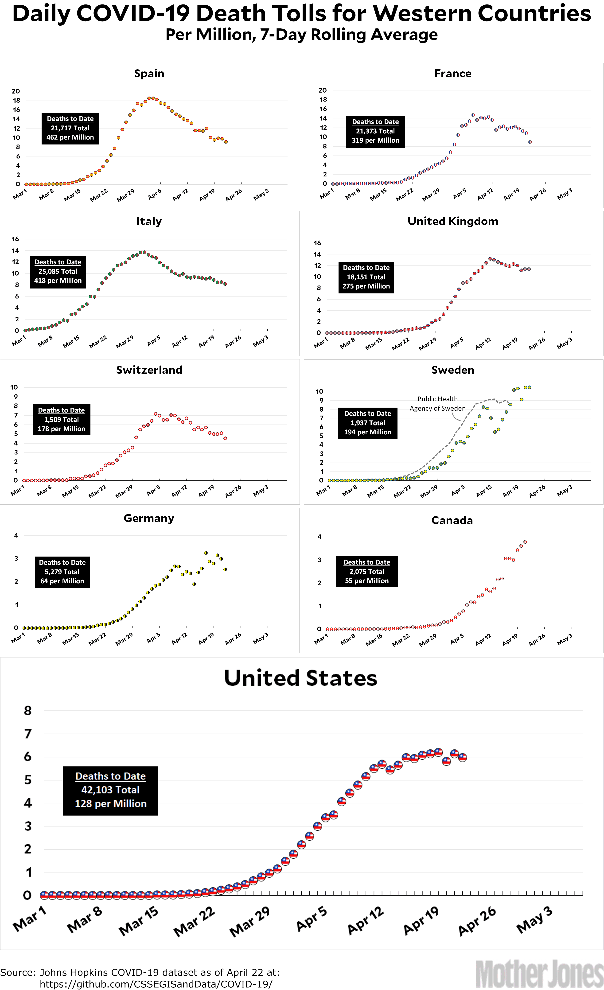
Here’s the coronavirus death toll through April 22. Something worth noting is that it’s now clearer than ever that the growth rate of COVID-19 is asymmetrical. That is, it goes up quickly, plateaus for a few days, and then declines slowly. What this means is that if you look at the death toll in the middle of the plateau, you probably have to more than double it to get the death toll for the entire first wave. Every country is a little different, and the death toll depends a lot on how stringently countermeasures are kept in place, but this is why a final death toll of 100,000 looks more likely than not for the United States.
The raw data from Johns Hopkins is here. The COVID Tracking Project is here. The Public Health Agency of Sweden is here.
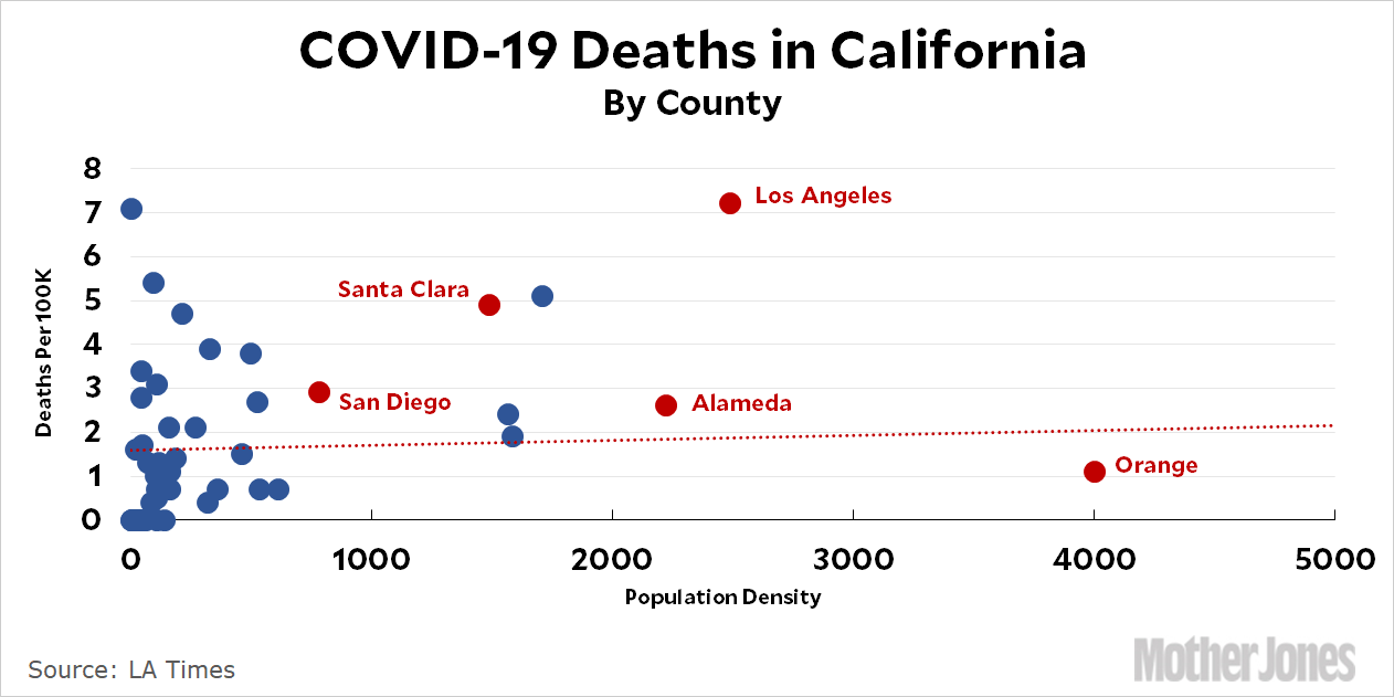
I continue to be sort of fascinated by the spread of COVID-19 in California. This is mainly because Orange County, where I live, is such an outlier:
Contrary to popular belief, Orange County is pretty dense but its incidence of COVID-19 is very low. Why is that? More generally, there’s not much of a correlation between density and COVID-19 mortality at all. In the upper left of the chart you can see a bunch of counties with very low population densities but surprisingly high rates of coronavirus deaths.
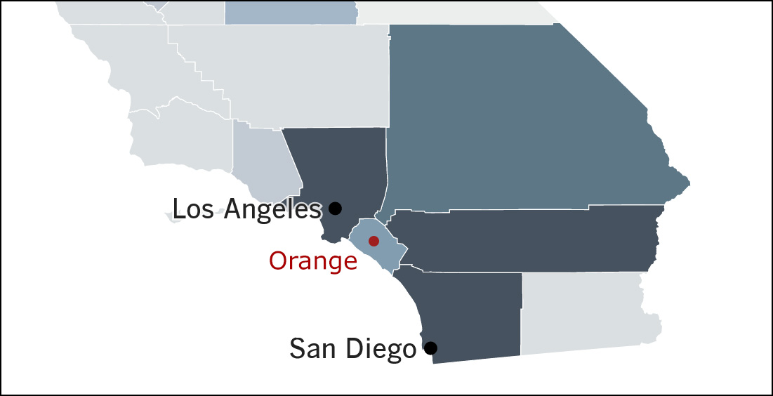
For the more visually minded of you , here’s a map of Southern California from the LA Times:
Orange County is an island of moderate COVID mortality surrounded by a sea of high mortality. What’s our secret?
This is just about the only picture of a living thing that I took on my Arizona trip—and it’s only barely living. And so the eternal question: is it better in color or black and white?
UPDATE: Not much agreement on this one. The tally is 7-5 in favor of color in comments.
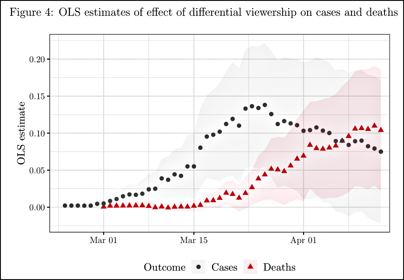
You’ve probably already heard the news that watching Sean Hannity is dangerous to your health, but you want to see the chart, don’t you? Here it is:
This is from “Misinformation During a Pandemic,” and it shows the increase in COVID-19 cases and deaths in counties that had high viewership levels of Sean Hannity’s show—where he pooh-poohed the danger of the pandemic—compared to Tucker Carlson’s show—where he told people to take the pandemic seriously. The Hannity viewers took his advice, and a lot of them ended up dead as a result:
Our estimates imply that a one standard deviation greater viewership difference is associated with 2 percent more deaths on March 21, 5 percent more deaths on March 28, and 8 percent more deaths on April 8, and 10 percent more deaths on April 11.
Of course, Hannity is small potatoes compared to the big kahuna, Donald Trump. I wonder how many people he’s killing every day?
Here’s the coronavirus death toll through April 21. Naturally, you’re all eager to hear my Solomon-like wisdom on what to do about the Swedish numbers, aren’t you? Let’s review:
If I use the Johns Hopkins daily numbers for Sweden, they are enormously noisy thanks to Sweden’s lack of reporting on weekends. On the other hand, they’re consistent with the way every other country is reported.
If I use the numbers from the Public Health Agency of Sweden, they’re corrected to show the actual day the death occurred. However, these numbers are updated every day to reflect new data and it takes a few days before they settle down. This means that numbers from the most recent few days are always lower than reality.
What to do? Two things. First, instead of a 6-day rolling average, I’ve switched to a 7-day rolling average. This means every dot encompasses a full week, including both weekdays and weekends. This smooths things out a little bit. Second, I’ve added the official Swedish numbers as a gray line, but I don’t include the most recent five days.
How’s that for sawing the baby in half?
One other note: the United States is already up to 40,000 deaths and appears to have plateaued, rather than peaked. At this point, even if we start to decline soon, it will probably be a long, slow decline and the total number of deaths will reach very close to 100,000. That’s a big change from last week’s optimistic assessment of 50-60,000.
The raw data from Johns Hopkins is here. The COVID Tracking Project is here. The Public Health Agency of Sweden is here.
Let’s review our president’s response to the COVID-19 pandemic:
He has no plan for mass testing.
He has already let everyone know he’s unenthusiastic about masks.
He wants to “liberate” states from stay-at-home orders.
He wants to open up non-essential businesses as soon as possible.
He appears to have no particular opinion about social distancing, school closings, or large gatherings.
In other words, he literally has no concrete response to the pandemic at all, aside from closing our borders and passing along damaging fictions about vaccines and folk remedies. Meanwhile, his own director of the CDC—no liberal shill by any stretch—is warning that the second wave of COVID-19 later in the year is likely to be worse than the one we’re going through right now:
Asked about protests against stay-at-home orders and calls on states to be “liberated” from restrictions, Redfield said: “It’s not helpful.” The president himself has tweeted encouragements of such protests, urging followers to “LIBERATE MINNESOTA!” and “LIBERATE MICHIGAN!”
Forewarned is forearmed, they say. We have the next six months to build more ICU capacity; stockpile masks and protective gear for doctors and nurses; increase our testing capacity by at least 10x; and prepare a huge PR campaign based on what we learn from the first wave of COVID-19.
Is there any sign that Trump is interested in any of this? Not that I’ve seen.
Did the price of oil “crater” today? You decide! Here’s the price of Brent crude, which provides a look at an international benchmark that’s not affected by storage issues in Cushing, Oklahoma. As you can see, it’s been dropping steadily all year, and the decline accelerated at the end of February when COVID-19 started to hit the economy. Today it fell 15 percent, which is a pretty healthy drop. On the other hand, today’s decline just put it back on the approximate trendline it’s been following for the past two months.
So it’s not so much that oil cratered today, it’s that oil has been plummeting by about 1 percent per day ever since February 20. The question is: how long will it keep doing this?
I’ve already told you the story of my disastrous visit to Villa de Leyva in Colombia, so I won’t repeat it here. I did get there eventually, just a little before sunset, but there were still lots of kite flyers in the village square and I wandered around taking pictures of them. This was the best of the bunch.
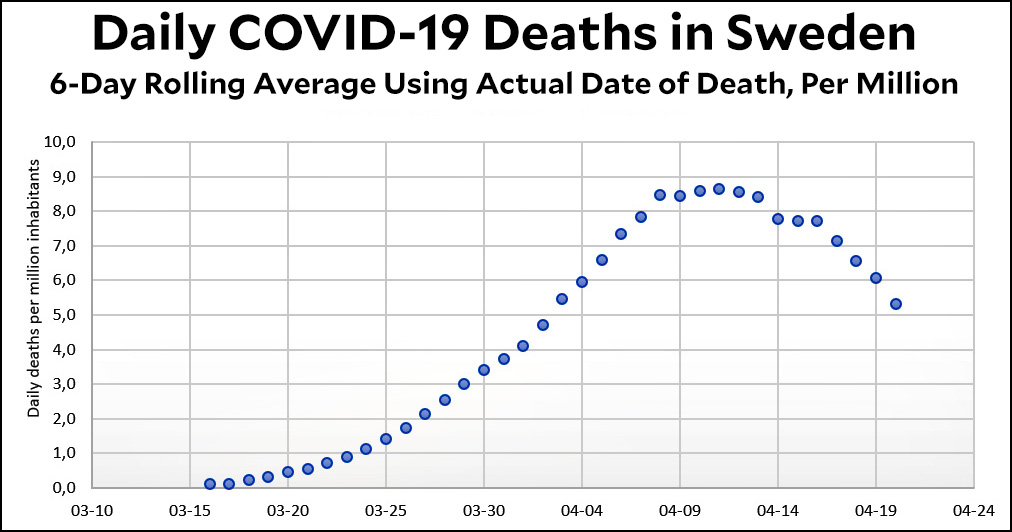
Reader AV sent me a nice email with a chart of COVID-19 deaths in Sweden. First, though, here’s my chart using Johns Hopkins data:
This chart is based on the date that deaths are reported to Johns Hopkins, which means that even using a 6-day rolling average isn’t enough to drown out the big variations in reporting on weekends. Here’s the chart based on data from the Swedish health authorities:
This is the same as mine (6-day rolling average, calculated per million population), but it’s been modified to show the actual date of death. As you can see, it’s much smoother and does indeed suggest that Sweden has peaked and is now declining.
Under normal circumstances I think the reported death date and the actual death date aren’t much different. But Sweden is an exception due to its custom that “weekends are sacred.” That includes reporting COVID-19 deaths, which is why the raw data shows wild swings on weekends and then catches up on Monday and Tuesday.
So will I adopt the Swedish version of COVID-19 deaths in my daily charts? Tune in tomorrow to find out!
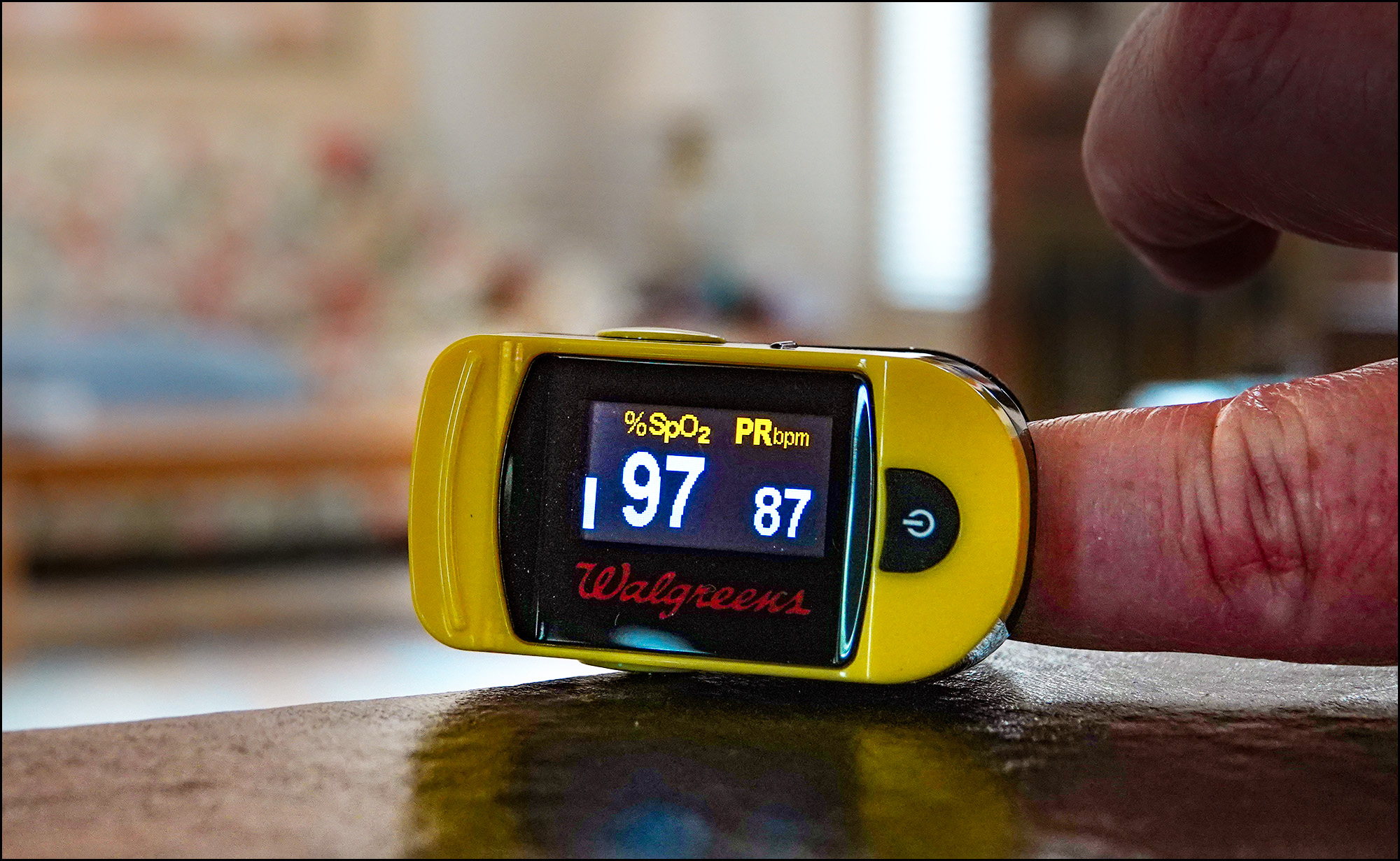
Just to follow up on this morning’s post, I did indeed go out to Walgreens and buy a pulse oximeter today:
Why not? It was cheap, and since I have breathing problems anyway it might be handy to have around. My reading of 97 percent is fairly ordinary. Below 90 percent is considered low. Below 85 and you might start thinking about checking into the ER for a COVID-19 test.
BY THE WAY: A reader emailed to tell me that you can get an oxygenation reading using an app on your cell phone. Don’t do it. I did a quick scan of the literature and phone apps got slammed pretty hard. If you’re going to bother with this at all, just buy a real one.
Can you pitch in a few bucks to help fund Mother Jones' investigative journalism? We're a nonprofit (so it's tax-deductible), and reader support makes up about two-thirds of our budget.
We noticed you have an ad blocker on. Can you pitch in a few bucks to help fund Mother Jones' investigative journalism?
Billionaires own the media, but they don’t own us.
At Mother Jones we know these aren’t conventional times, and they require unconventional coverage. That’s what we deliver every day: fierce, independent journalism you can’t find elsewhere. Perhaps never in the history of our country has that been more necessary than now. But we can’t do it without reader support—your support. Please chip in today.