Back when I first started charting the spread of coronavirus I decided not to use a logarithmic scale. I figured that log scales were fine for communicating with other professionals, but most laymen have no clue what a log scale is and have difficulty interpreting it even when they’re given an explanation.
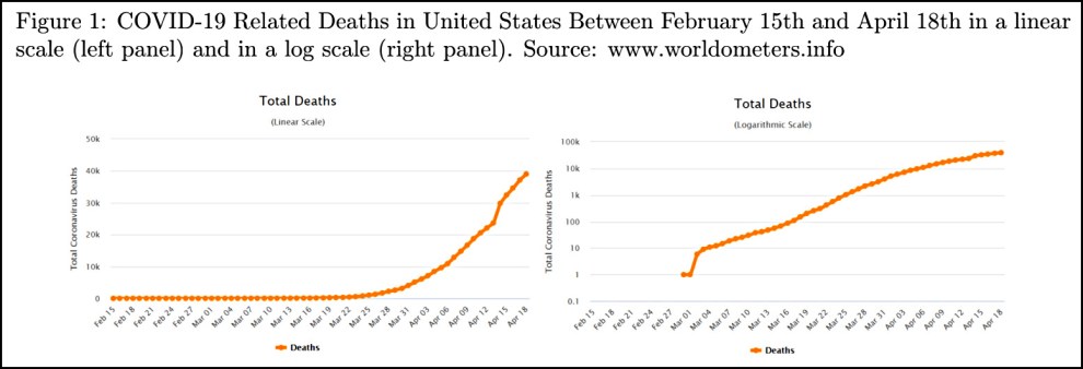
Naturally, then, I’m thrilled to pass along a study from the LSE School of Public Policy that confirms I was right. They showed people the following two charts:

I think they put their finger on the scale by starting the y-axis of the log chart at 0.1, but I don’t suppose many people actually noticed that. In any case, here are the results:
We find that the group who read the information on a logarithmic scale has a much lower level of comprehension of the graph: only 40.66% of them could respond correctly to a basic question about the graph (whether there were more deaths in one week or another), contrasted to 83.79% of respondents on the linear scale. Moreover, people in the logarithmic group also proved to be worse at making predictions on the evolution of the pandemic: they predicted, on average, 71,250 deaths for a week after the experiment was taken, whereas the linear group predicted 63,429.
The first finding here is peculiar: since both charts feature lines that are steadily increasing, why would anyone have trouble saying if there were more deaths in one week vs. another? The later week will always have more. That’s odd.
The second finding, however, is the key weakness of a log chart: people have a hard time interpreting the scale. In the log chart, the final dot looks like it’s at around 60-70,000 deaths or so. It’s not, of course, because the the distance between 10K and 100K increases on a log scale just like the rest of the chart. But most people simply don’t understand that. The linear chart, by contrast, shows clearly that the final dot is at 40K and the death rate is growing quickly.
So how does this affect attitudes toward the COVID-19 pandemic?
First, we find that despite predicting a higher number of deaths, people who were shown the logarithmic scale chart declare to be less worried about the health crisis caused by the coronavirus.
Divergences, however, don’t stop there. The scale of the graph they see affects people’s responses concerning their policy preferences and stated behaviours. Ceteris paribus, respondents who see the information on the linear scale graphs support less strongly the policy of keeping non-essential businesses closed than those who look at the logarithmic one — although they also favour reopening them later. At the same time, those who see the linear graph are more willing to support a hypothetical state-level tax aimed at providing citizens with masks.
It’s not surprising that people shown the log chart are less worried about the virus. The log trendline simply doesn’t look like it’s growing that fast. It’s peculiar, though, that folks shown the linear chart are less supportive of keeping non-essential businesses closed. That’s hard to explain. In any case, I guess I’d like to see a complete breakout of the policy stuff so that it’s clearer how strong the effects are.
Bottom line: Ditch the log charts if you’re writing for a non-professional audience. They leave a seriously misleading impression.


