
I think Brad DeLong makes a good point today. It’s true that we lost a lot of traditionally blue-collar-male jobs to China in the early aughts, but the trade deficits that crowded-out those jobs also had a mirror-image effect:
Imports crowd-in traditionally-male blue-collar wholesale trade jobs, and finance traditionally-male blue-collar construction (and capital-goods manufacturing) jobs.
If you look at all traditionally-male blue-collar jobs—wholesale, construction, manufacturing, and mining—what you get is not a story of the trade deficit, but rather a story of (a) macro shocks to aggregate demand, and (b) the long-run technology-and-preferences trend—some of which is automation….[The China shock was] a big deal for places that found their manufactures competing with new imports from China, yes. But not for blue-collar traditionally-male employment in the country as a whole.
Needless to say, the exact effect of the China shock depends a lot on precisely what you define as “blue-collar-male jobs,” and you can make the effect bigger or smaller depending on where you draw the line. Still, there’s no question that some other jobs got better at the same time that manufacturing declined. This means the overall effect of the China shock is smaller than we usually think it is.
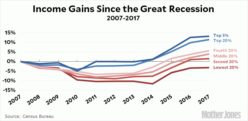
But before the China shock we had the dotcom bust and afterward we had the Great Recession, which devastated all the traditionally blue-collar-male jobs. The manufacturing jobs are the most obvious ones because they had already undergone years of decline, but the loss was just as great (or greater) among truck drivers and construction workers and warehouse workers. The real problem, as DeLong says, is that we recklessly inflated two bubbles in a row and then failed to do enough to recover from them. And when we did finally recover, most of the income gains went to the affluent, not to blue-collar workers.
That’s the problem, not China.
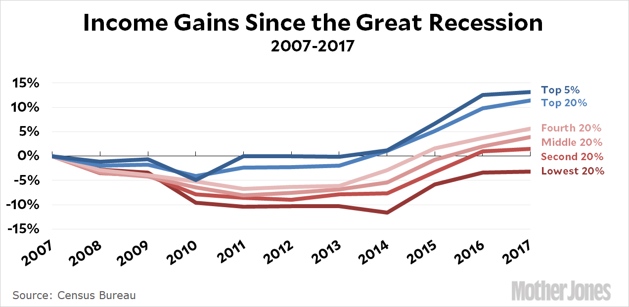
UPDATE: Several people have suggested that the growth of the top 20 percent only looks strong because it includes the top 1 percent. What would that line look like if it excluded the top 1 percent (i.e., included only the 80th percentile through the 99th percentile)?
Census data won’t tell us that, so I headed over to the tables on high incomes put together by Thomas Piketty and Emmanuel Saez. They show that both the top 10 percent and the top 1 percent have grown at about the same rate since 2007. It’s pretty reasonable to think that the top 20 percent looks a lot like the top 10 percent, which suggests that’s it’s also grown at about the same rate as the top 1 percent. In other words, if you exclude the top 1 percent, the chart would hardly change at all.