

Today let’s discuss one of the great blogging controversies of our time. Having dispensed earlier with the Oxford comma (yes) and how to treat the word data (it’s singular), it’s time to take on the great Dual Y-Axis Dispute.
I’ll illustrate this with a chart I made up. Suppose I want to show that economic growth leads to high employment. Does this do the job?
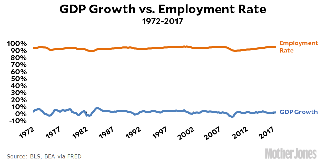
This chart does indeed show both GDP growth and employment, but it’s almost impossible to tell if they’re related in any way. To show them both, the chart has to scale all the way to 100 percent, but when the scale is that large you can barely even see the peaks and valleys, let alone whether they’re related. So instead I can do this:
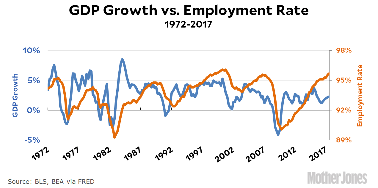
By using one y-axis for GDP growth (on the left) and another for the employment rate (on the right), you get a good view of how and when each of them has gone up and down. It’s now clear there’s a relationship, as you’d expect, but it’s also not perfect. Why did the huge Reagan expansion produce only modest employment growth? Conversely, why has the modest Obama/Trump expansion produced huge employment growth? Seeing the data presented this way helps to make things clearer and can spur further questions.
Now, there’s no question that a dual y-axis can be confusing. It’s just not something we’re used to seeing. I always try to make my dual-y charts easier to read by labeling them in different colors so it’s immediately obvious which line goes with which data series. I also do my best to adjust the axes so that the numbers on both sides line up properly with the gridlines.¹
So the question is: Does the clearer presentation of the relationship make up for the added complexity of the chart? And is there a better way to show it? I’d answer definitely yes to the first question, and usually no to the second. Sometimes there is a better way, but not always. Sometimes it’s either a dual y-axis or nothing.
And, really, what’s the objection? I’ve been a big fan of chart guru Edward Tufte for decades, and his mantra was to simplify as much as possible and to ruthlessly eliminate “chart junk.” This is good advice, but ever since Tufte became popular it’s become advice that many people take too far (as Tufte himself did later in life, I think). Eventually you get to the point where you’re making it harder to read a chart because it’s become so spare that it lacks the visual cues readers expect. You can eliminate gridlines entirely, for example, but that makes it harder on the reader who wants to look at a chart carefully and get a real sense of the data behind it. When you sacrifice that, you can easily end up with a wiggly curve that’s more just a directional symbol (something is going up, or down, or U-shaped) than a true chart.
So that’s my take on dual y-axis charts. Yes, they add some clutter and complexity. Yes, they can be confusing to a casual reader. You should do your best to address that. But sometimes it really is the simplest, least cluttered way of making a point. When that’s the case, don’t let either personal dislike or the misplaced authority of Edward Tufte stand in the way of using them.
¹FWIW, this is harder than it sounds.