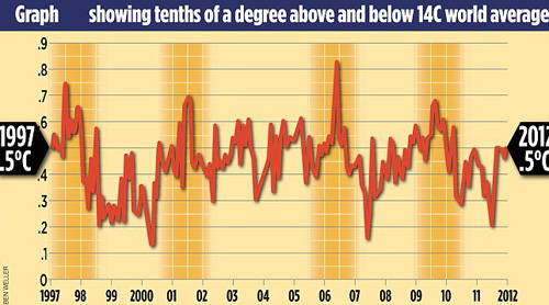
For years, climate deniers have been producing charts that use the El Niño year of 1998 as a starting point. Why? Because it was an unusually hot year, and if you start there it looks like global warming has “paused” for a good long time. Here’s a colorful example of the genre from the Daily Mail a few years ago:

These charts are no longer useful to the deniers thanks to the very high temperatures of the past couple of years, so they’ve gone away. But what will take their place? I was amused to discover the answer a few days ago: 2016 doesn’t mean anything because it was an El Niño year.
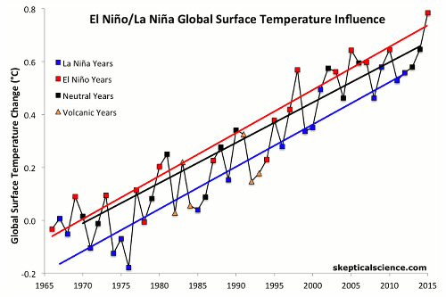
Hah! Nobody ever said they didn’t have chutzpah. But it got me curious: what does a global temperature chart look like if you pull out just the El Niño and La Niña years? That seemed like a lot of work to get right, so I put it aside. Today, however, I found out that someone else had already done it for me. Here it is:

This comes from a Weather Channel piece titled “Note to Breitbart: Earth Is Not Cooling, Climate Change Is Real and Please Stop Using Our Video to Mislead Americans.” The chart itself apparently comes from skepticalscience.com, but I can’t figure out exactly where to link to it. [UPDATE: Here it is. It’s an animated GIF!] However, it shows the historical data clearly: El Niño years (in red) are always hot, but have been getting steadily hotter. La Niña years (in blue) are always cool, but have also been getting steadily hotter. And the years in-between (in black) have been getting steadily hotter too. Long story short, every kind of year has been getting steadily hotter for a long time.
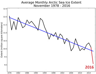
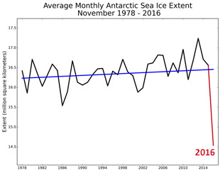
And this year is a real champ. Here’s the latest from the National Snow and Ice Data Center:


Both poles are showing massive ice loss compared to trend. We’ve never seen anything like it. You can draw all the misleading charts you want, but it doesn’t change the facts. Climate change is real, and it’s getting worse.


