Global Warming Blows Past Previous Records in 2016

Fight disinformation: Sign up for the free Mother Jones Daily newsletter and follow the news that matters.


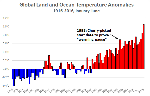
It’s been a while since I posted a chart showing the latest global temperatures, so let’s do one today. This is based on NOAA data for the first half of the year. As you can see, average global temperatures have risen about 1.3°C over the past century.

For years, climate denialists published charts starting in 1998 to show that warming had “paused” and might never increase again. Needless to say, an anomaly of +0.7°C looks kind of quaint these days as we blew right past +1.0°C during this year’s El Nino. Those old charts have, of course, now disappeared. But no worries. They’ll be replaced by something else, I’m sure.

Fact:

Mother Jones was founded as a nonprofit in 1976 because we knew corporations and billionaires wouldn't fund the type of hard-hitting journalism we set out to do.

Today, reader support makes up about two-thirds of our budget, allows us to dig deep on stories that matter, and lets us keep our reporting free for everyone. If you value what you get from Mother Jones, please join us with a tax-deductible donation today so we can keep on doing the type of journalism 2022 demands.

payment methods

Fact:

Today, reader support makes up about two-thirds of our budget, allows us to dig deep on stories that matter, and lets us keep our reporting free for everyone. If you value what you get from Mother Jones, please join us with a tax-deductible donation today so we can keep on doing the type of journalism 2022 demands.

payment methods

We Recommend

Latest

Sign up for our free newsletter

Subscribe to the Mother Jones Daily to have our top stories delivered directly to your inbox.

Get our award-winning magazine

Save big on a full year of investigations, ideas, and insights.

Subscribe

Support our journalism

Help Mother Jones' reporters dig deep with a tax-deductible donation.

Donate