

The world is awash in charts these days. It’s a great example of a simple proposition of economics: when something gets cheaper to produce, we produce a lot more of it. Just as computers turned a dozen daily pieces of mostly useful snail mail into hundreds of mostly useless emails, they’ve turned data laboriously collected by experts and then laboriously converted into clunky bars and lines by the art department into colorful masterpieces that can be created by pretty much everyone at the push of a button or a modest investment in learning Excel. Half the charts I produce for this blog come either directly from my good friends at the St. Louis Fed or indirectly by downloading their handy datasets into Excel.
There are lots of sites that produce charts these days, with new ones popping up all the time. Joshua Tucker points us today to V-Dem, which provides “15 million data points on democracy, including 39 democracy-related indices.” The V-Dem website tells us that it is “a collaboration among more than 50 scholars worldwide which is co-hosted by the Department of Political Science at the University of Gothenburg, Sweden; and the Kellogg Institute at the University of Notre Dame, USA.” So let’s take a look.
V-Dem is pretty easy to use: pick one or more countries, one or more variables, and a time period. Click “Generate Graph” and you’re off. So let’s take a look at a few that I drew more or less at random. Here’s #1:
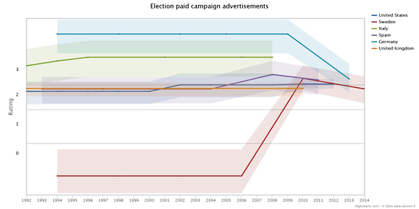
That’s peculiar, isn’t it? We’re used to thinking of the United States as the king of money in politics, but we’re actually the steady blue line right in the middle. Italy apparently spends more than us and Germany spends a lot more. But in the 2000s, Germany plummeted down to middle and Sweden skyrocketed up to the middle. By 2013 we were all pretty much the same.
Of course, I have no idea what this is based on. In theory, I could download the codebook and eventually decipher the data sources, but you can probably guess what the odds of that are. So for now it remains a bit of a mystery. Here’s #2:
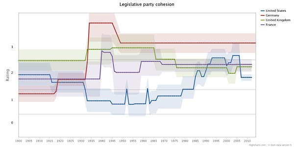
This one is less surprising. It tells us that in the mid-1900s American political parties weren’t very cohesive. Then around 1980 they started to become much more cohesive, looking more and more like parliamentary parties in Europe. Oddly, though, V-Dem thinks that Democrats and Republicans got a bit less cohesive around 2005. This contradicts the conventional wisdom enough that it might be worth someone’s while to look into it. #SlatePitch, anyone? Here’s #3:
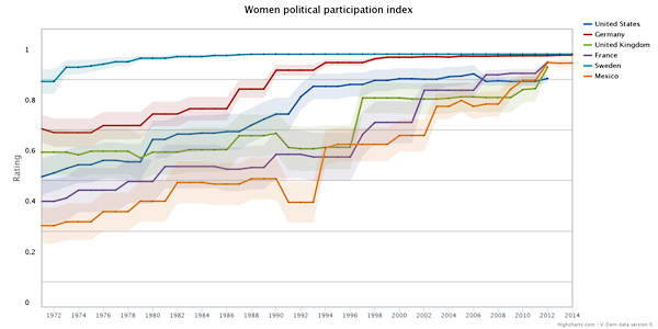
Sweden and Germany are the winners here, unsurprisingly. But the US does pretty well too. We’ve gone from a distant fourth place in 1972 (among the seven countries shown) to a close tie for first. Of course, everyone else has gotten a lot better too. In fact, if you want to zoom way in for the details and take a glass-half-empty approach to things, we’re actually in last place now. We were doing pretty well until 1993, but since then we’ve made almost no progress. Once again, if this is true it would be interesting to investigate. What happened in 1993 to suddenly blunt the rise of women’s participation in politics?
So that’s that. On the upside, there’s a lot of data here and it’s pretty easy to generate colorful charts out of it. It’s interesting too. Three out of three random charts that I created instantly posed challenges to the received wisdom that might benefit from further study. On the downside, it’s difficult to figure out the source of the indices or to download the data series themselves unless you’re willing to download the entire dataset and load it into your statistical app of choice. That makes further study hard for non-experts. Nothing’s perfect, I guess.