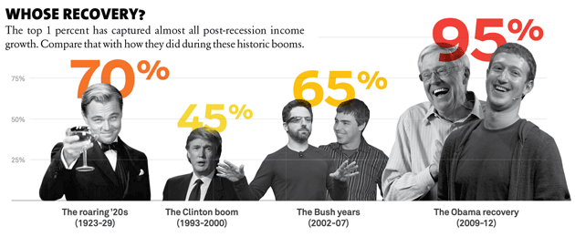
It’s not easy finding new and interesting ways to illustrate the growth of income inequality over the past few decades. But here are a couple of related ones. The first is from “Survival of the Richest” in the current issue of Mother Jones, and it shows how much of our total national income growth gets hoovered up by the top 1 percent during economic recoveries. The super-rich got 45 percent of total income growth during the dotcom years; 65 percent during the housing bubble years; and a stunning 95 percent during the current recovery. It’s good to be rich.

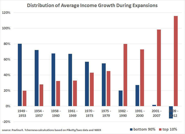
But there’s more! The next chart, via Ryan Cooper, shows this trend even more explicitly. It comes from Pavlina Tcherneva, an economics professor at Bard College, and it also shows the distribution of national income growth during economic expansions. The difference is that it shows the share of the top 10 percent, and it shows it for every single expansion since World War II.
It’s a pretty stunning chart. The precise numbers (from Piketty and Saez) can always be argued with, but the basic trend is hard to deny. After the end of each recession, the well-off have pocketed an ever greater share of the income growth from the subsequent expansion. Unsurprisingly, there’s an especially big bump after 1975, but this is basically a secular trend that’s been showing a steady rise toward nosebleed territory for more than half a century. Welcome to the 21st century.


