Graphic of the Day: Hospital Infections

Fight disinformation: Sign up for the free Mother Jones Daily newsletter and follow the news that matters.

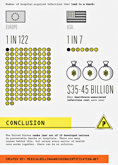
UPDATE: This chart appears to be completely wrong. Apologies. More details here.

Via Chris Bodenner, this graphic compares fatal hospital infections in the U.S. to those in Europe. This might disturb you at first, but remember: the free market is always right, so clearly we’ve collectively made a rational choice here. We’ve decided that although our healthcare costs are far higher than in Europe, this is worth it in return for far higher death rates from hospital infections. Best healthcare in the world, baby!

More graphic at the link.

Fact:

Mother Jones was founded as a nonprofit in 1976 because we knew corporations and billionaires wouldn't fund the type of hard-hitting journalism we set out to do.

Today, reader support makes up about two-thirds of our budget, allows us to dig deep on stories that matter, and lets us keep our reporting free for everyone. If you value what you get from Mother Jones, please join us with a tax-deductible donation today so we can keep on doing the type of journalism 2022 demands.

payment methods

Fact:

Today, reader support makes up about two-thirds of our budget, allows us to dig deep on stories that matter, and lets us keep our reporting free for everyone. If you value what you get from Mother Jones, please join us with a tax-deductible donation today so we can keep on doing the type of journalism 2022 demands.

payment methods

We Recommend

Latest

Sign up for our free newsletter

Subscribe to the Mother Jones Daily to have our top stories delivered directly to your inbox.

Get our award-winning magazine

Save big on a full year of investigations, ideas, and insights.

Subscribe

Support our journalism

Help Mother Jones' reporters dig deep with a tax-deductible donation.

Donate