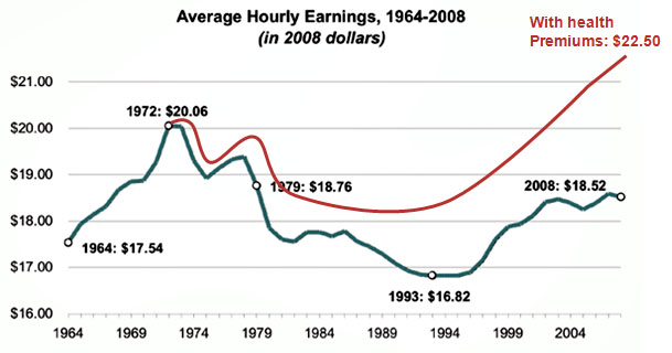

Business Insider promises us today “15 Mind-Blowing Charts About Wealth And Inequality In America.” I don’t think any of them will come as a big surprise to readers of this blog, but it’s nice to see them all in one place. Below is the chart on average hourly earnings, which I’ve modified to show (approximately) what it would look like if you added income in the form of rising healthcare premiums. Basically, even if you do that, average income has only increased from $20/hour in 1972 to about $23/hour today. That’s roughly 12% over four decades, or about 0.3% per year, during an era in which per-capita productivity has grown at something like five times that rate. Our economy has generated a ton of increased income over the past few decades, but hardly any of it has trickled down to the average worker.