
A woman sunbathes on Tuesday in Los Angeles, where California authorities have issued excessive heat warnings.Nick Ut/AP
This story was first published by CityLab and is reproduced here as part of the Climate Desk collaboration.
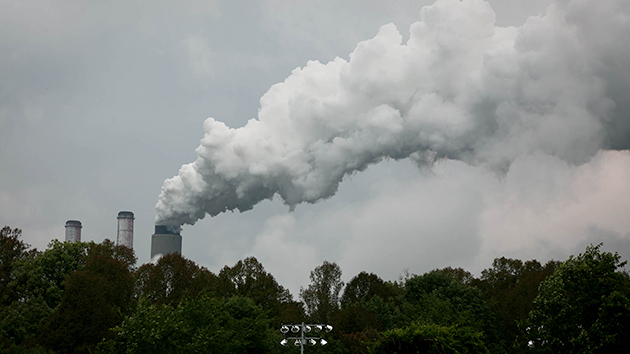
America’s coasts are melting. California has posted weather warnings for temperatures as much as 20 degrees above average, and yesterday’s 97-degree heat in Manhattan demolished a 93-degree record that had stood since 1919.
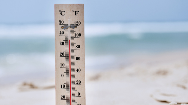
So with the sun turning cheeks the color of tomatoes and crotches into sweat swamps, it’s time to ask the question: Is this the hottest day of the year?
Depends where you live. Most areas of the U.S. have already passed the date of their average highest annual temperatures. A few, like the California and Pacific Northwest coasts, are suffering through them right now. San Francisco and parts of Hawaii, meanwhile, can expect the average hottest day to arrive sometime next month.
Day-to-day weather will always show abnormalities somewhere—check out what the late-season warmth is doing to trees in Central Park—but the general arrival of peak heat in America is nicely on display in this map from NOAA. (Alaska, Hawaii, and Puerto Rico are represented here.) Based on annual maximum temperatures from the 1981-2010 U.S. Climate Normals, the graphic shows regions that perspire earlier in yellow and later in orange and red:
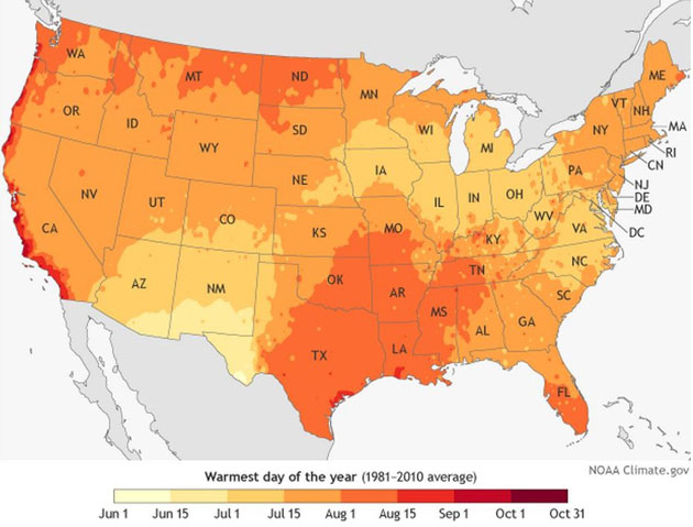
June marks the height of the sun’s radiation barraging the Northern Hemisphere, but temperatures keep rising because the “rate of heat input from the sun during the day continues to be greater than the cooling at night,” writes NOAA. That means most places don’t hit their most torrid days until mid-July to mid-August. Here’s the atmospheric agency further parsing the geography of America’s heat:
The lightest and darkest areas of the map show just how variable the U.S. climate can be. The lightest colors (earliest warmest day) occur in New Mexico and Arizona. This early arrival reflects the influence of the North American Monsoon, a period of increased rainfall affecting the U.S. Southwest in mid-to-late summer. The region’s highest temperatures tend to occur in June, before the monsoon’s clouds and rain set in.
The darkest colors occur along the Pacific coastline, where the persistence of the marine layer—a persistent layer of clouds that forms above the chilly coastal waters—maintains cool temperatures in early summer. In many locations, the warmest days on average do not occur until September when the fog lifts. While the map shows warmest days of the year on average throughout the United States, this year’s actual conditions may vary widely based on short-term weather and climate patterns.